Having used emoncms 6.9 (I think) for a couple of years I changed to 9.7 yesterday. Haven’t change before as I anticipated a world of pain and I wasn’t dissapointed.
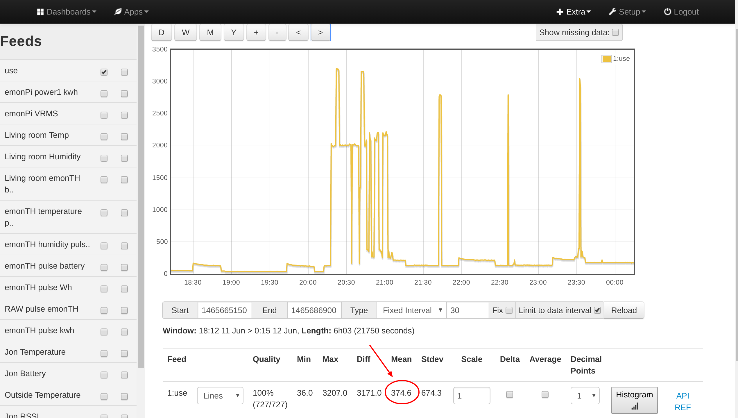
Some of my dashboards have raw data graphs and in the old version they would show the average value of the data in the window, so you could see the energy used in a given period. This was very useful, but seems to have disappeared in the current version of emoncms.
Thanks for the suggestion, but it’s not really a suitable replacement. It’s very unwieldy - I have in excess of 200 feeds and finding the right ones in an unordered list isn’t easy. I’m not sure if it could be put in a dashboard.
Of course it’s better in many ways, the fading tooltips are a great improvement and being able to see a spot value is useful, but for me the original energy display has much more utility.
Yes, that had crossed my mind, but I don’t think it would be very easy to implement and wouldn’t let you interactively set a period of interest.
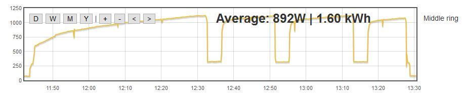
However, in my research into how to do it I found that there is still a standard visualisation that behaves similarly to the earlier raw data graph. The second graph of the simple zoom visualisation does it. Not a very good option as you have to select the second graph each time it is displayed, but it might do.