Heat Pump Experimentation App - Release News

I know what you mean, but really, any two of Efficiency, Using and Producing would convey the same info and you only need whichever of Outside and Effective you actually use. Full details are on the graphs scrolling down.

Failing that, floating divs with a minimum width should adapt to screen width better than a table anyway. Three columns where possible, two where not, and so on. I’ll try to mock it up after I finish on a customer’s store front today, unless you scream that you hate the idea and it’s never getting merged.

I can now access the config, and select a bunch of settings I couldn’t before (like solar, which is nice). The main MMSP display still shows while editing the config, whereas other EmonCMS apps (e.g. My Heatpump) hide theirs while configuring. Not a huge issue, just seems a little odd.

I had to edit config/application-configuration.json to have engine = "0,2,5" to get some of my feeds to appear, as I’m using MYSQLTimeSeries (0) and PHPTimeSeries (2) for some of them.
(I’m not sure I’ve picked the right engines for my feeds, but I’m kinda stuck with them now).

Room Temperature is showing in the chart, though I need to fix the rounding of my data: :smiley:
image

Edit: looks like "fixed": 1 is missing from RoomTemperatureZone1’s “displayOptions”.
It works better after I add this line to the config:

image

That’s unexpected. I don’t see that. You aren’t being misled by the huge JPEG embedded on the config page are you?

Yep, that’s right.

Yeah, I have all my data stored externally so I can switch by dropping the feeds and replaying all my historic data.

This should sort you out.

1 Like

Thanks.

I should mention that I use “Using” to compare how much it’s using relative to things like the cooker or the car. “Produced” probably not so interesting.

I look at the delta between “Outside” and “Effective” to make sure it looks sane given the conditions - notably I want to see it get bigger during a storm. I partly use it to see if the anemometer has blown off (again!)

That’s true, but you can’t really see them very well on the phone, so I tend to use the big round numbers up the top, especially if I’m just showing it to some poor person who doesn’t want me telling them about heat pumps :slight_smile:

Let’s see what your mock-up looks like and we can make it look lovely for you @mjr

Here you go @mjr

1 Like

D’oh! - totally missed the fact that those charts aren’t from my own heat pump :man_facepalming:

Thanks for the fixes.

2 Likes

How is the Efficiency being plotted? I get a slightly different shape when I plot CoP directly. Is there some smoothing or something?

image

MMSP app at the bottom, graph of CoP on the top, both to same scale [0 - 5] and size.

Yes, absolutely @Timbones

pretty much in response to Simon’s comments:

1 Like

Enhancement ideas that I’m being too slow to investigate myself:

  • Show the time somewhere when hovering on the graphs, so I don’t have to zoom in until the time axis is precise enough.
  • Some easier way to select “yesterday”, such as the 24h view defaulting to start at yesterday 00:00 if Show Latest isn’t selected, or making “tdy” then “<” display that.
  • Show the total runtime of the Main pump (maybe all pumps) for the period shown.

Yes, that sounds useful.

I did have it, but I took it away because I wasn’t using it. It’s normally late in the day when I use the app so I just look at today.

Have a look around the other apps and see how they name to help this app be vaguely consistent.

Yep, that would interesting. Well, especially back when I had that data :slight_smile:

This might need to come from the server because if there’s a large time window the granularity of the data will mean you can’t really tell how much it was on/off in the segment. I think it does something like 800 chunks in the desired time window so you’d be safe doing it client-side whilst a chunk is less than one minute. Maybe non-integer-minute segments would still be wrong though.

Thanks for sharing.

Me too, but it’s a bit annoying for the < arrow on “tdy” view to go backwards 22½ hours and the “24h” view not to align easily with dates (and what’s shown on My Heat Pump).

Maybe just “% on” estimates, or give up when the chunks get too big, then?

What if you fetch the average values across that window, and then added them up? Divide by the number of samples (i.e. 800) to get the %age on-time.

For the pumps, could you take a look at what the API can return and see if it can return something you like the look of?

For time navigation doing “yesterday” is a pretty trivial change in the time navigation. I literally am just drawing a blank on a compact representation for it in the bar:

I don’t see “yesterday” in the other apps, except on the Octopus Agile one where I see it’s been handled with a combo because it’s even more exciting. I’m not mad keen on that, but could be talked into it if shown.

image

The bad news is that I just looked on my phone and the current time navigation bar takes the whole width of the screen. Arguably “yesterday” would be more useful than “week”, “month” and “all” on mobile.

image

What do you think folks?

Personally, I prefer “6h”, and I’ve hacked my own branch to include that on the bar, and it opens to that timescale by default. I find that “10m” is not much use to me and I never use it.

I’m not sure that “w”, “m” or “all” are that useful either, as I’d probably be looking at daily summaries by that point, a la EmonCMS’ own Heat Pump app: clicking on a day will zoom in to show the charts for that day; can MMSP app show a “history” view?

I don’t object to having to use a drop-down instead, as I’m used to using that on graphs anyway.

I realise now that all we need is the average value for the entire period, so if you’re viewing a 1 hour window, you’d ask the feed for start time to end time with an interval of 1 hour.

image

We only need the first result from this query - the second one is for the following hour.

(It is possibly more efficient to request “6:30” to “7:00” with 30 minute interval and get the second half-hour for free, and then take the average of both results, but that’s maybe overly complicated)

1 Like

I’ve done something wrong when reinstalling this app and now any attempt to open the app results in this pop-up:

EmonCMS Error

Message: ReferenceError: config is not defined
Route: app/view?name=MMSPHeatPump
Line: 526
Column: 9

Initially, I’d forgotten to copy mmsp.json to the data folder, but after doing that and selecting it, the error persists. Does anyone know how to decode the above error (line 526 of what?), define the configuration and/or remove broken apps from the menu?

Edit to add: I figured out that changing “view” in the URL to “remove” will remove the broken app. However, adding it again still makes the same error, so I’d still welcome any hints.

Edit to add: removing the app and re-doing the git clone seems to have brought it back. I’d still welcome any hints on what the Line refers to.

It’s this line:

Which confusingly is not line 526 in the source. When you view the page source in your broken (or fixed) app you’ll see it appears on line 526. A load of script is getting injected that is altering the line number at runtime.

When moving from v10 to v11 @Timbones and I added an approach to get the config from both places to make the code cross-version.

It looks as though appconf.js wasn’t being loaded from anywhere for you. It’s ironic that it was crashing in the error handler. Just to help improve things in the future, didn’t you get an error dialog from this line of code:

app_log(“Error”,“Unable to load your settings, using the defaults”)

The comment on (source) line 245 warns that loading the config into the Javascript and then parsing it at runtime is incredibly risky. It’s not helped by my app_log not including any information about the error.

So I’m not quite sure how you ended up with a version that didn’t work at all. I can only conclude at the moment that the lack of a config JSON caused it to get upset and then stay upset.

MyForest

How about this @Timbones @mjr as a way to see the pump operation proportion?

Show pump operation time in graph summary

2 Likes

Yeah, looks good.

OK, that’s merged.

The heat pump experimentation app now includes the proportion of time the water pumps have been active in the time window. For example, it could look like this:

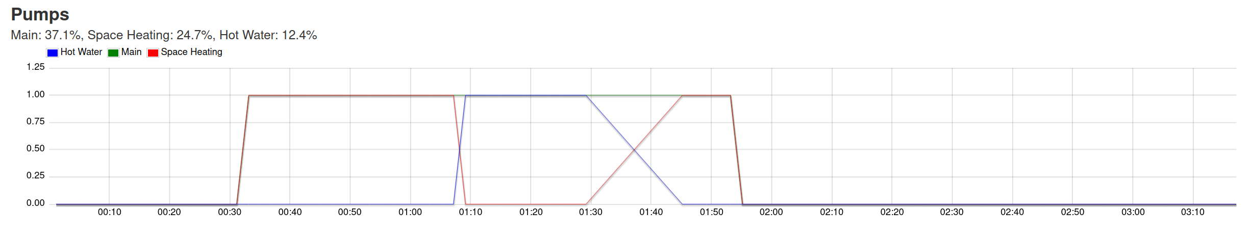
This is useful for reviewing if your attempts to run the heat pump continuously are working so the the pumps run all the time, or in the other direction, it will show you’ve been able to run your heat pump less time if you are trying to run an experiment where you try to turn the heat pump off.

I’ve tried to see if I can make this produce nonsense to hunt for bugs, but it seems to behave sensibly. It’s not as robust to weirdness as I might like so I may make it more cautious, but I won’t do another announcement here.

I opted not to use the section-heading because it would dilute the message in the heading. It would also be quite a lot of text. In other section-headings we have some compact data, but I couldn’t think how to represent this compactly without making it harder to decode. Maybe the icons for radiator and hot water tank would suffice. Let’s see what people think.

2 Likes