On the browser based My Solar Divert app, could the selected time period “button” be shown in a different colour so that one can more easily see what one is looking at. I know that one can check the X Axis data, but a coloured button (similar to the iOS app) would be good.
Also, is the data at the foot of the “Month” view the last 28, 29, 30 or 31 days (& does it include “today”)?
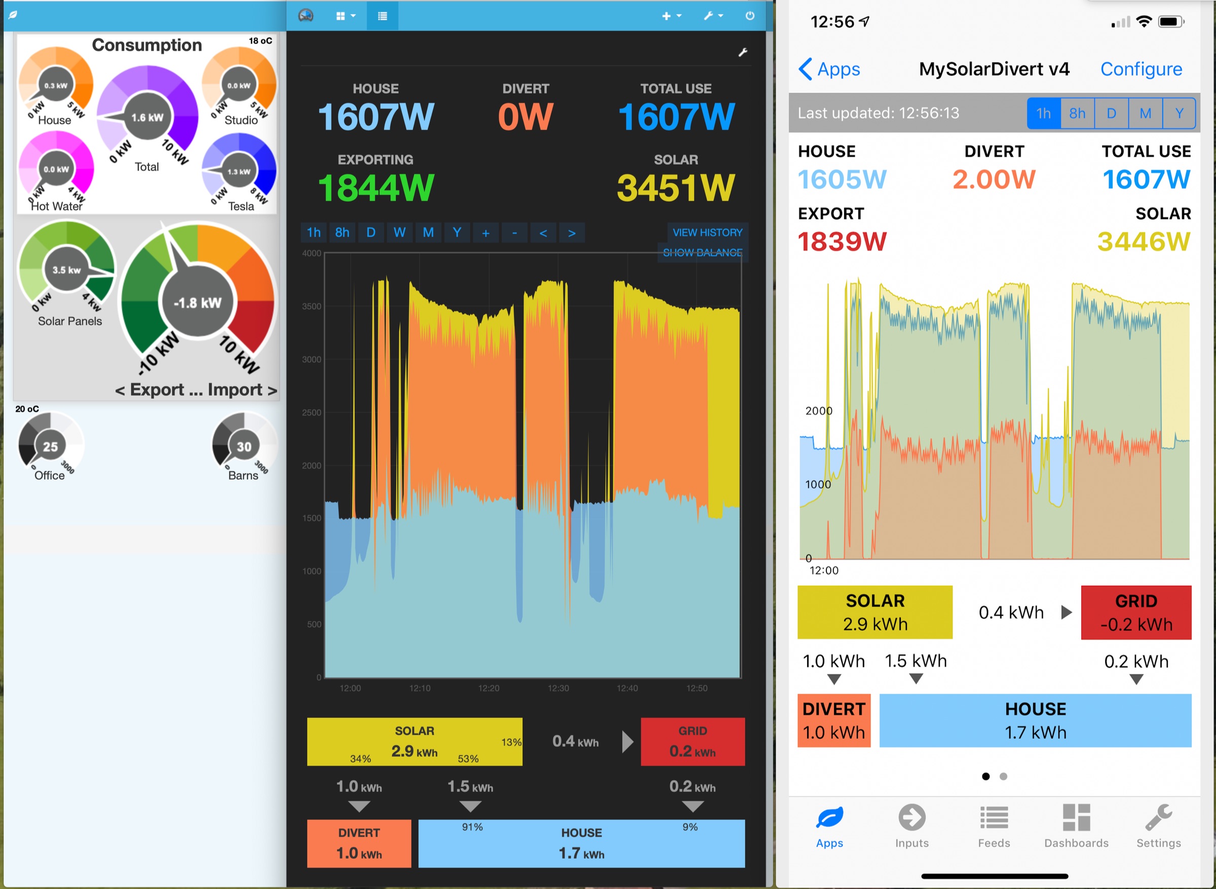
Also, should the "export to Grid"value in the browser App and iOS App not be the same; if you look at the three displays I have created (taken at almost the same time, hence suffer from slight update mis-matches), you can see on the browser app the Export figure is +0.2kWh, whereas on the iOS app it shows as -0.2kWh.
Not hugely important, but just different.
Finally, what does the “Show Balance” line actually show when presented?
I’d second that request for the browser-based graph application. Seeing which button is selected merely by the presence or absence of a dotted line is not very distinctive, and when you launch a stored graph, even that highlight isn’t present. A colour change would be much more functional, even if it doesn’t conform with current ‘flat’ design-think-mantra.