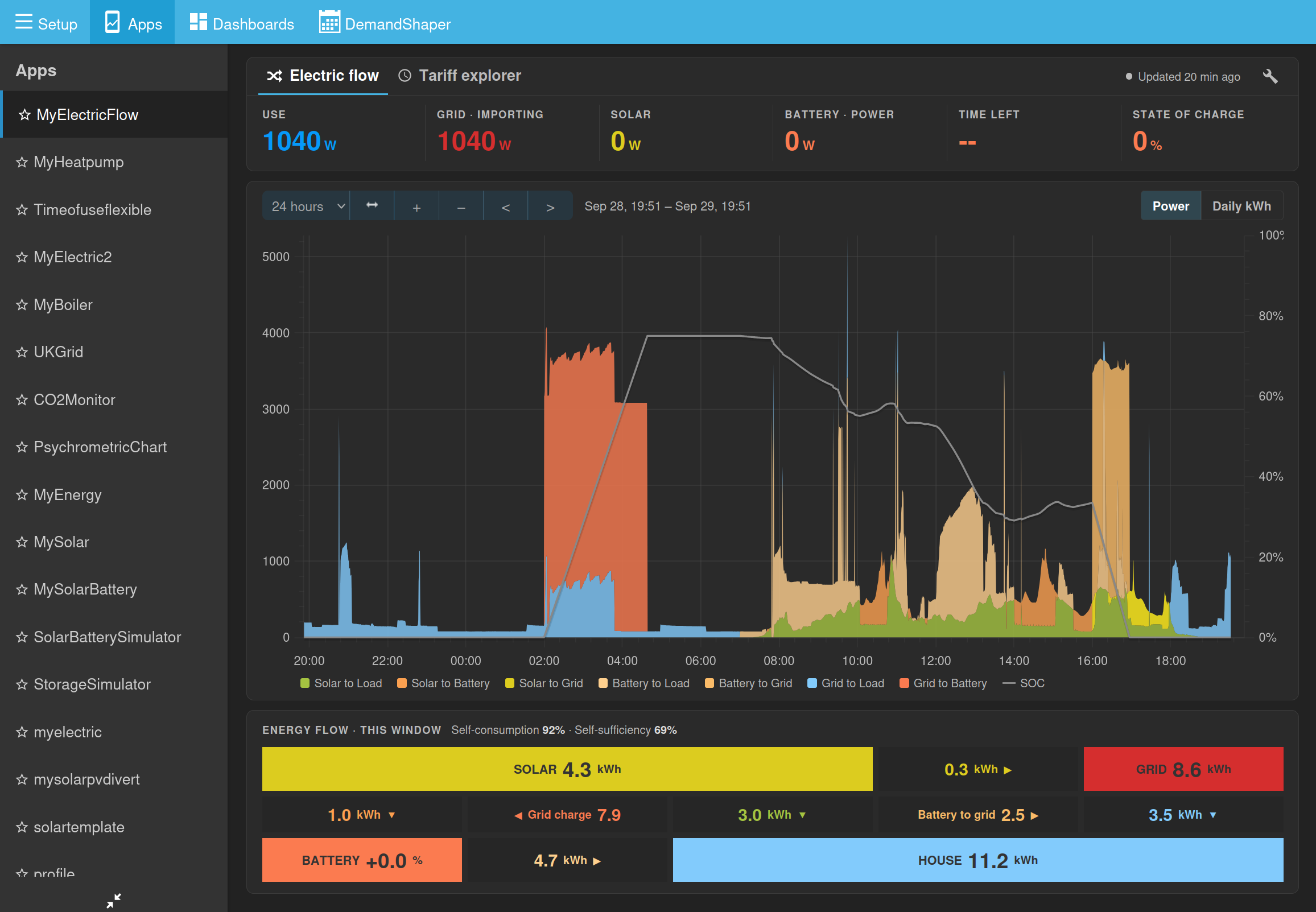
I’ve noticed a recurring display issue in Emoncms: when using a dark theme or background, the axis labels are rendered in a color that is almost black, making them extremely difficult (or nearly impossible) to read against the dark background.
Could this please be adjusted in the CSS or theme settings to ensure proper contrast for dark mode users?
I see the same just going into emoncms.org and browsing to any of the apps I use - myelectric, mysolarpv, my Solar Divert,mySolar battery etc - I hadn’t even spotted this as I’m so used to glancing at the relative bar heights - I can’t see any setting or link to dark mode either on desktop browser or phone - be nice to revert it however - thanks!