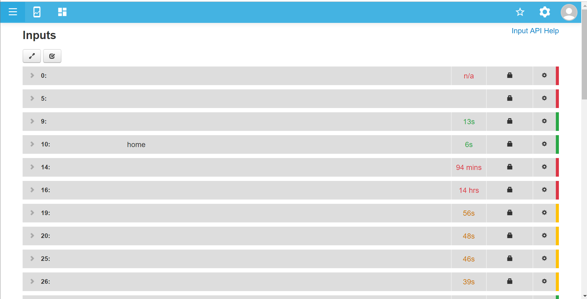
Likewise I can zoom out to 175% and see something similar to what you see
it’s pretty much the same as I would see on a smaller screen, just larger, not better quality nor more detail nor a longer time frame displayed. Just bigger. For example that menu column down the left edge is now way oversize at 150mm (6") wide.
Also note the page footer overlap too.
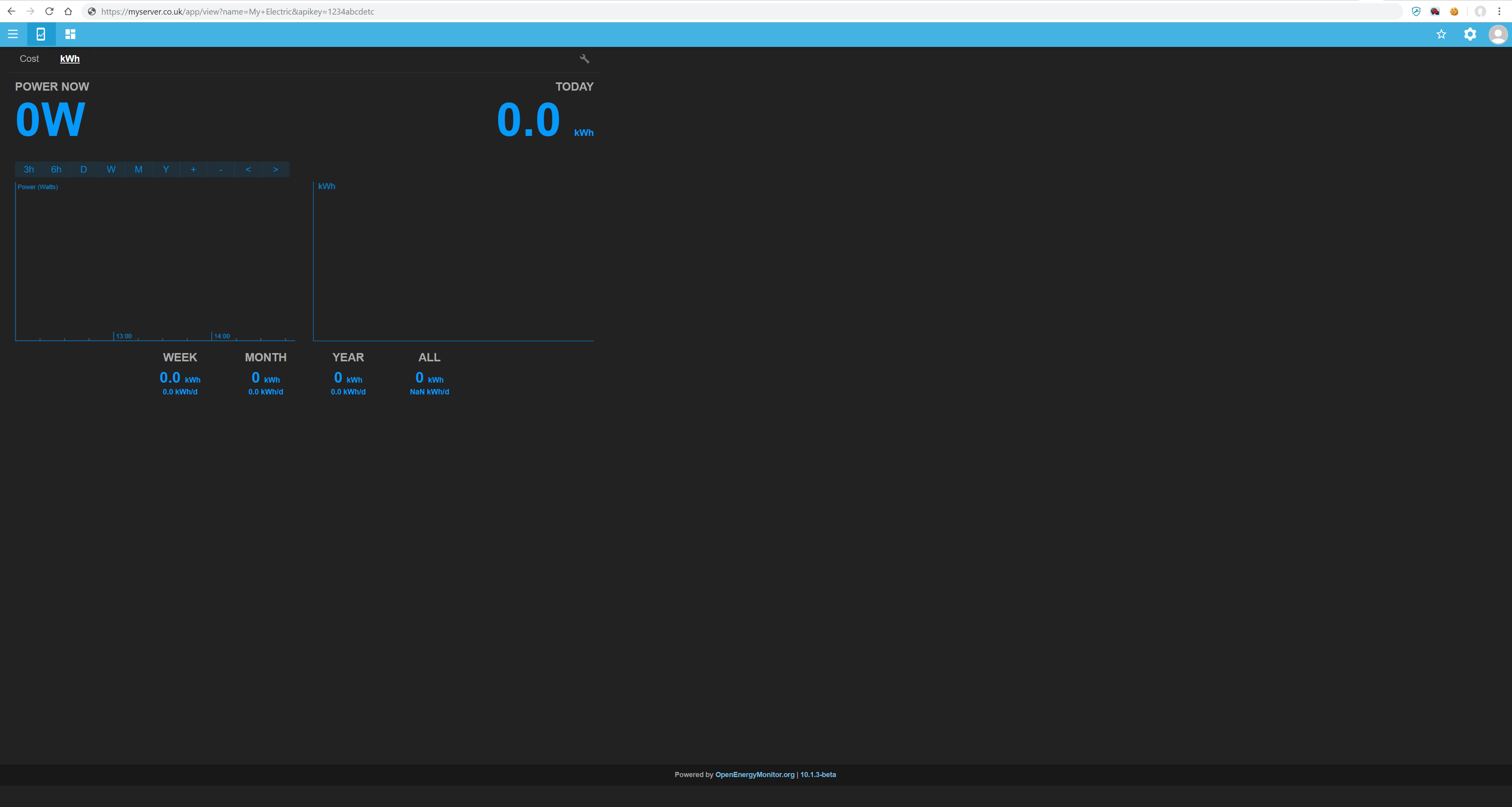
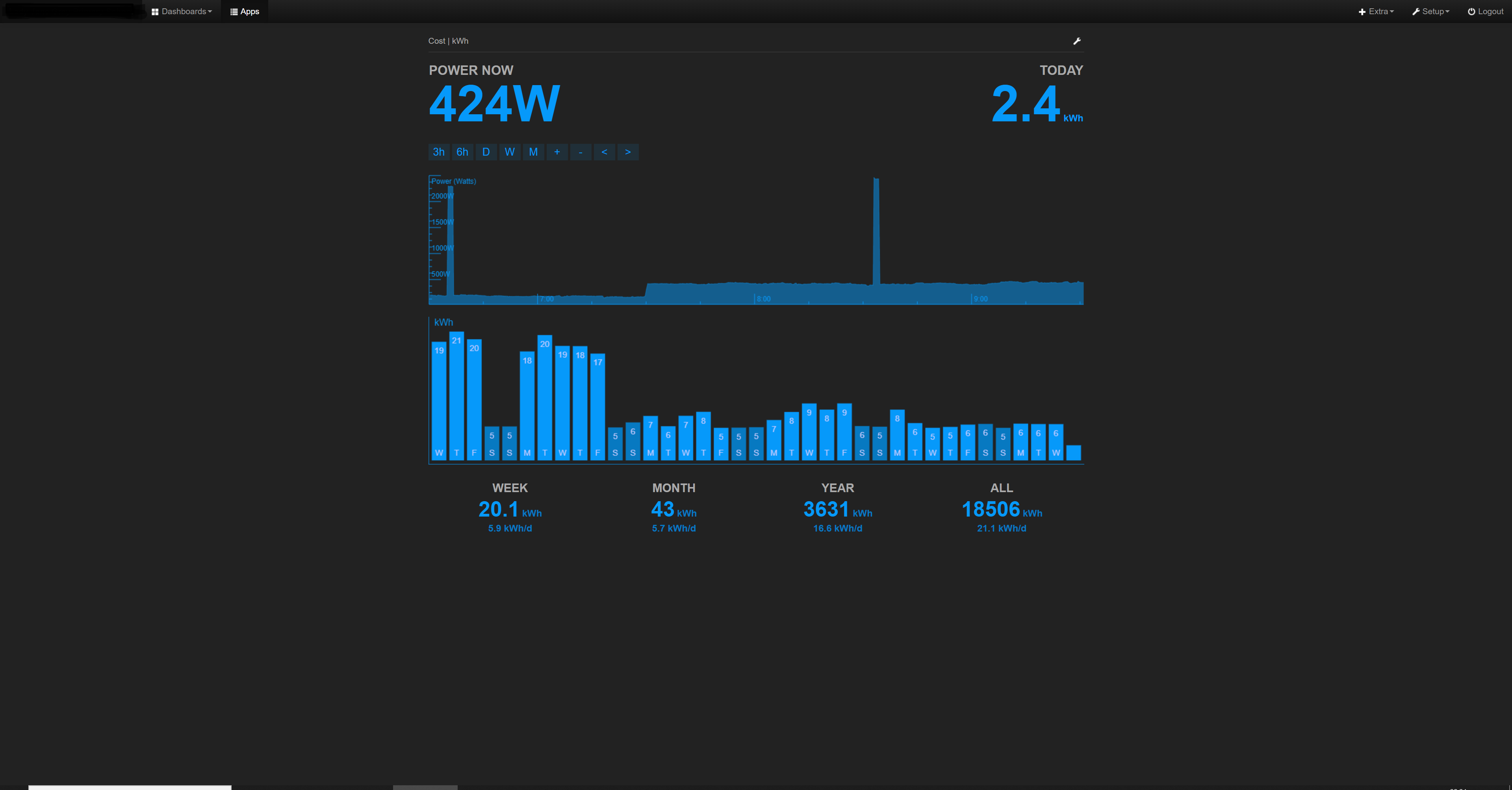
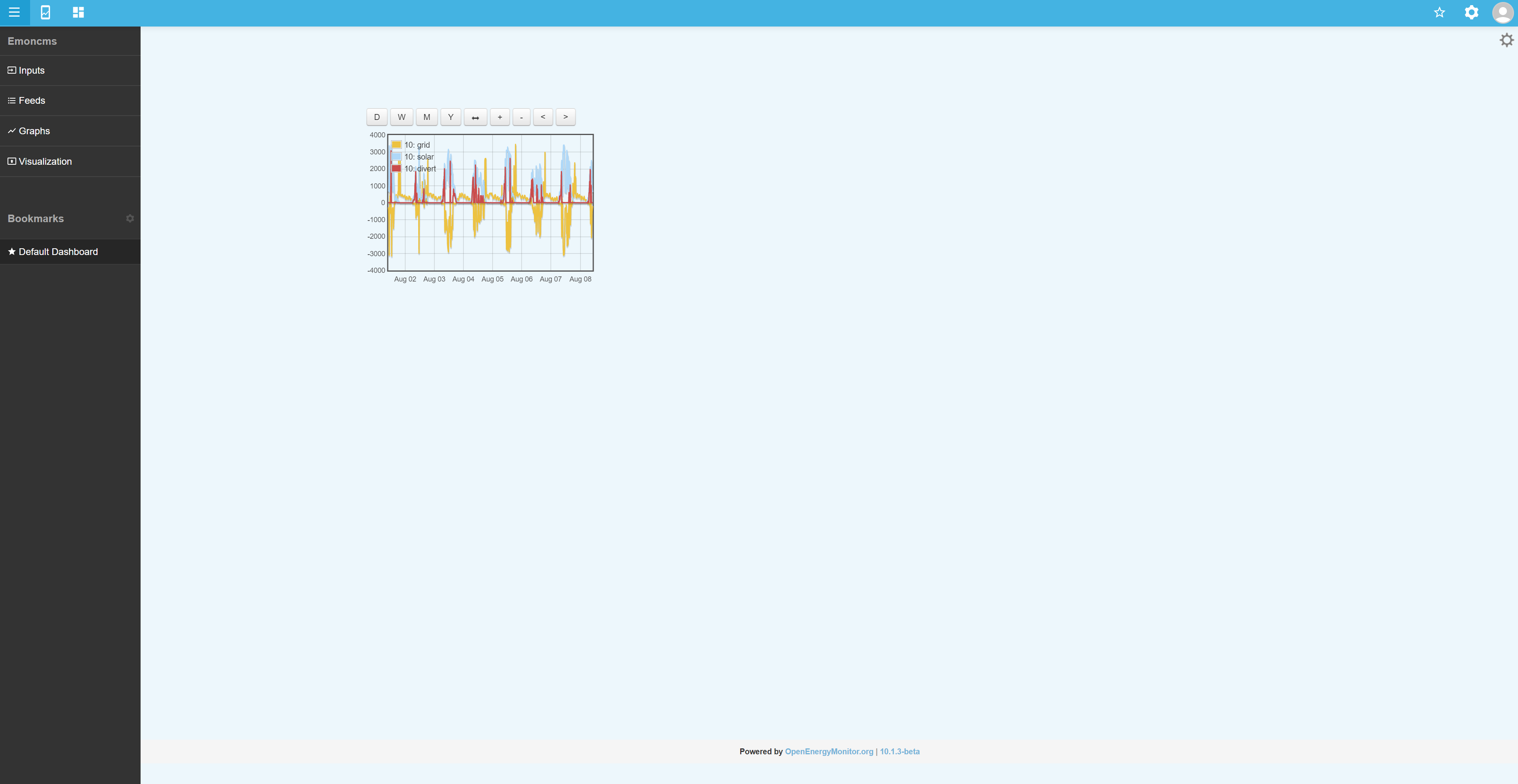
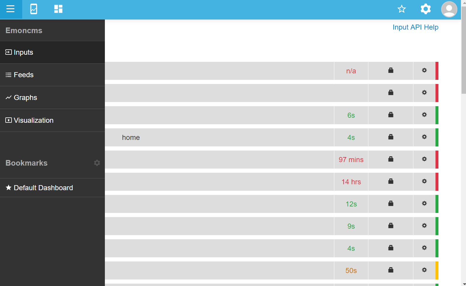
This is a pre v10 myelectric page at 100%, the browser is fullscreen but the webpage is just open on a tab, the “$fullwidth” setting is false on this live server.
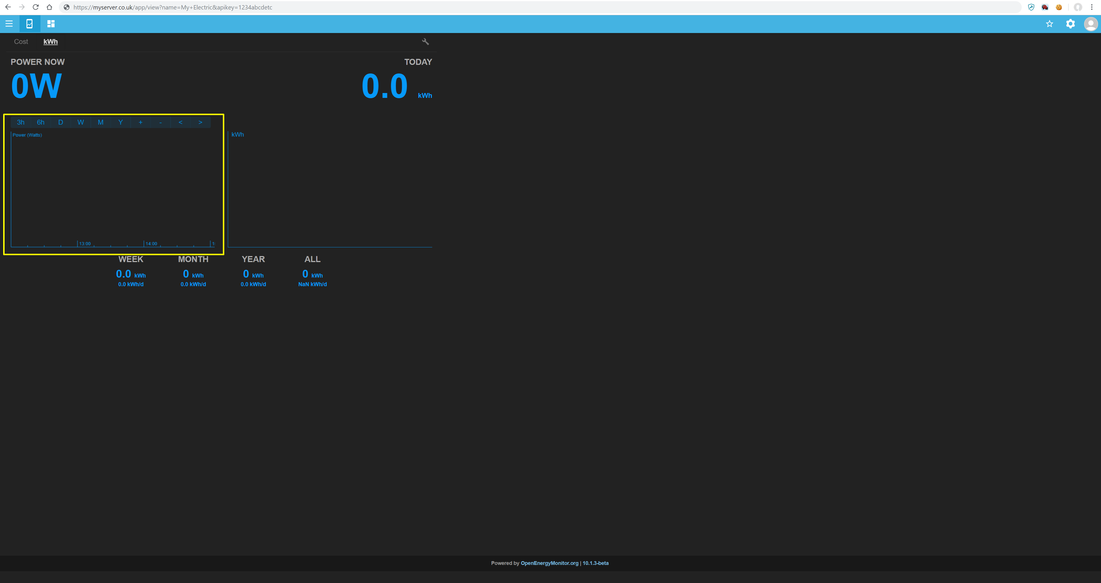
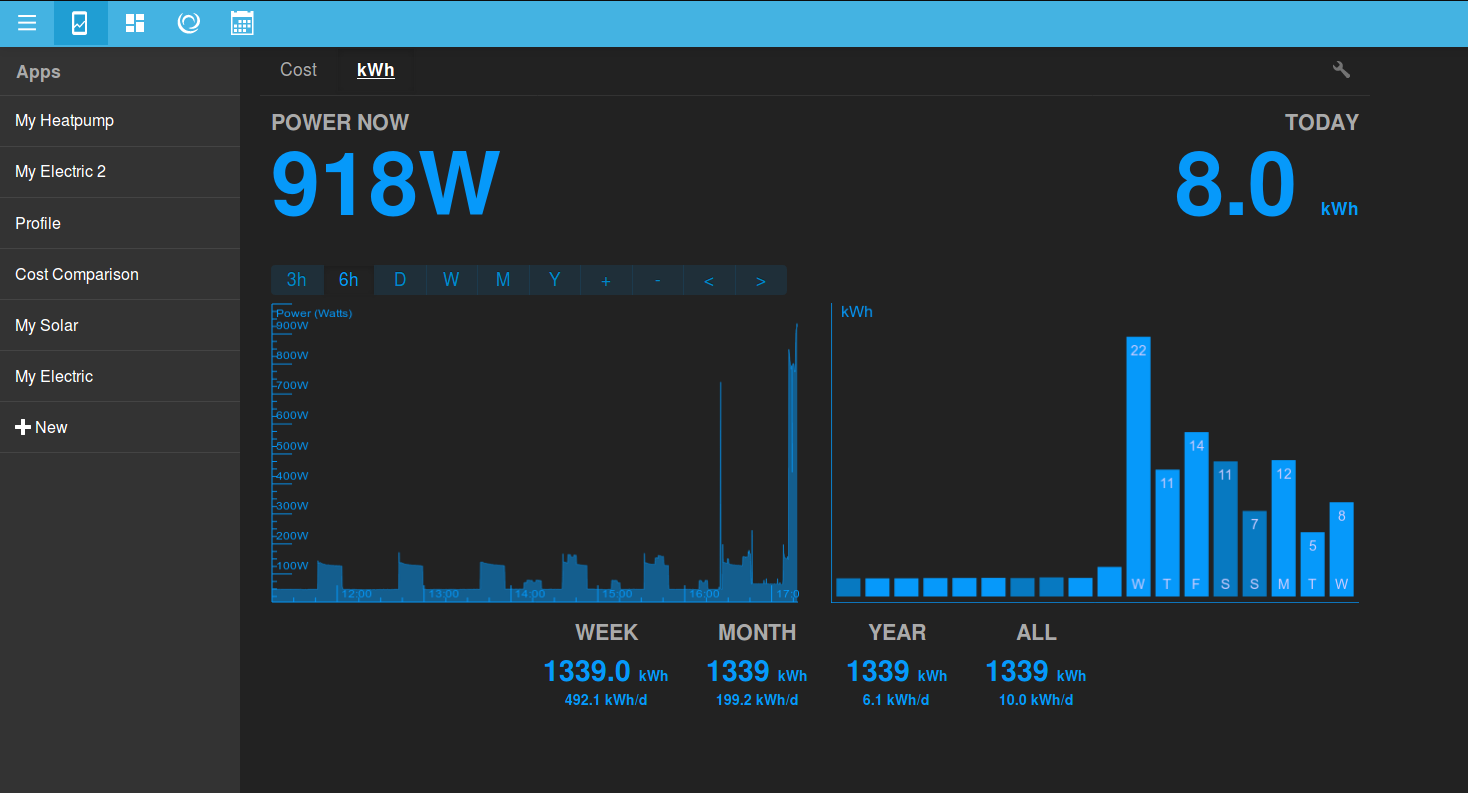
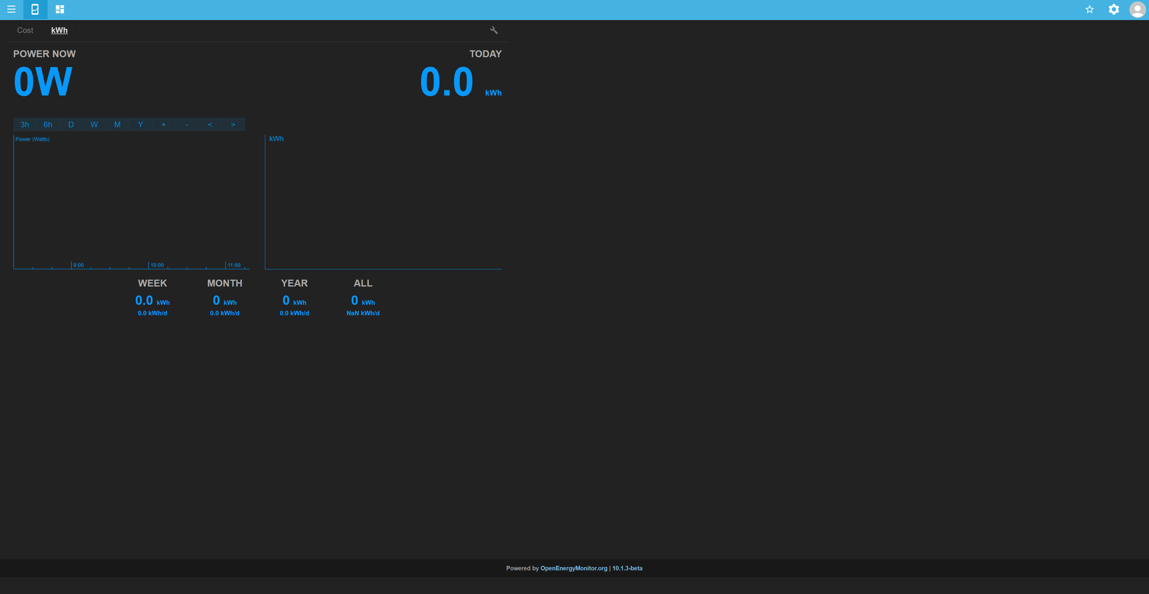
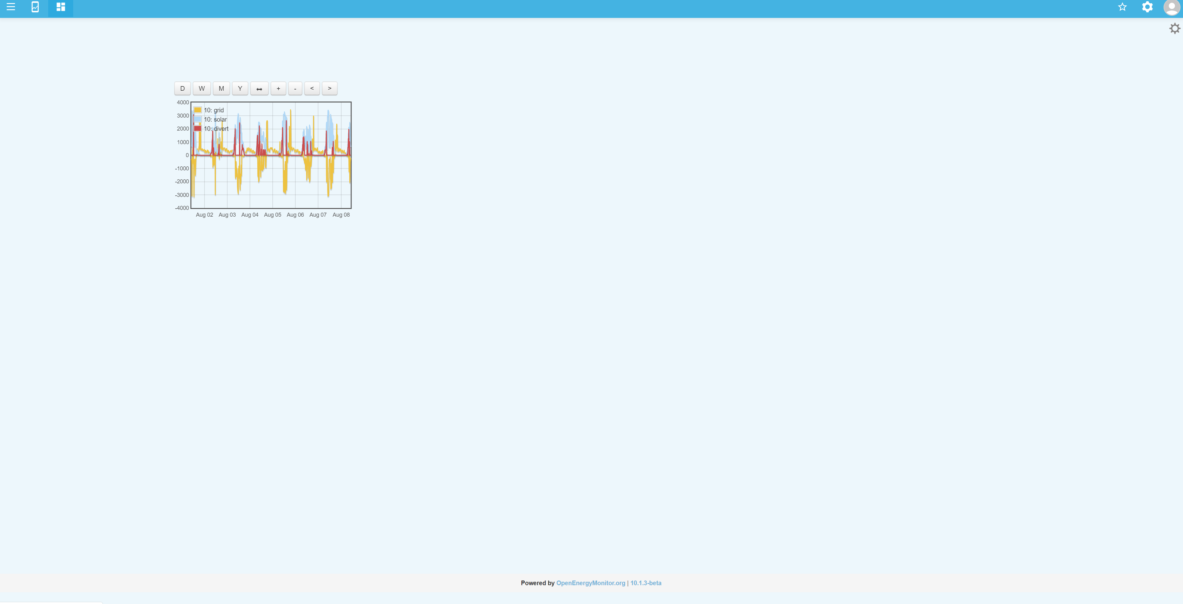
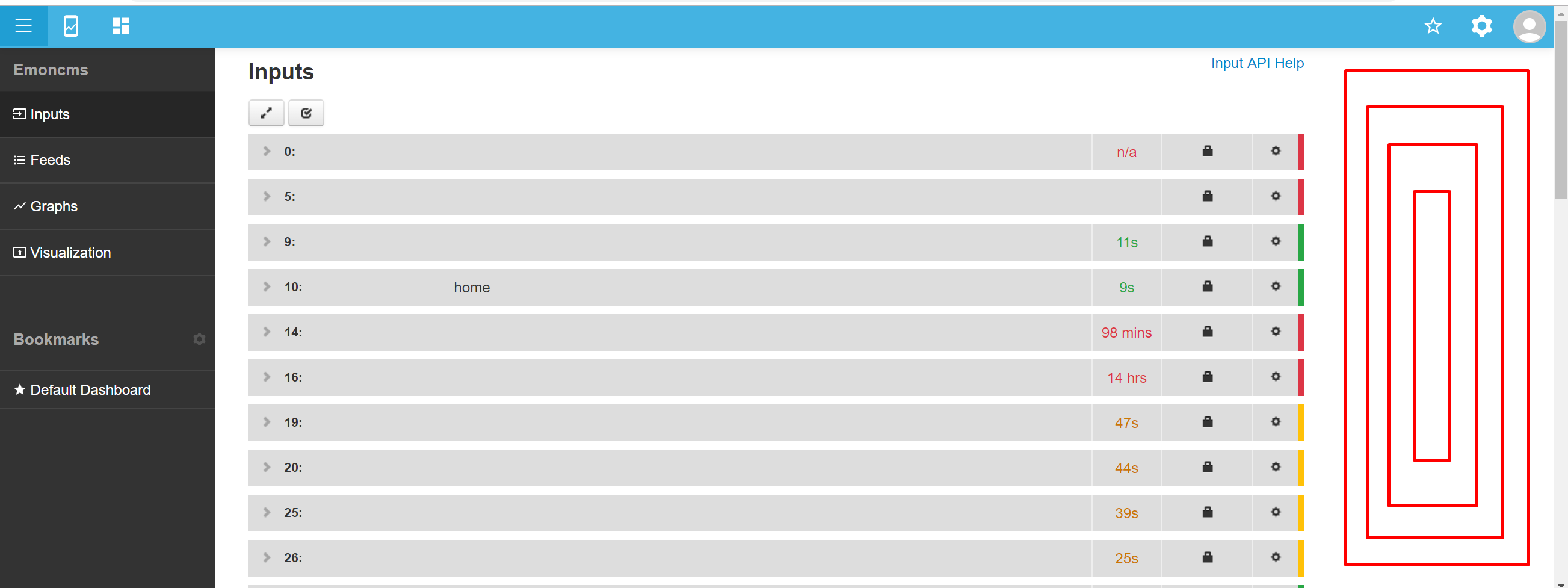
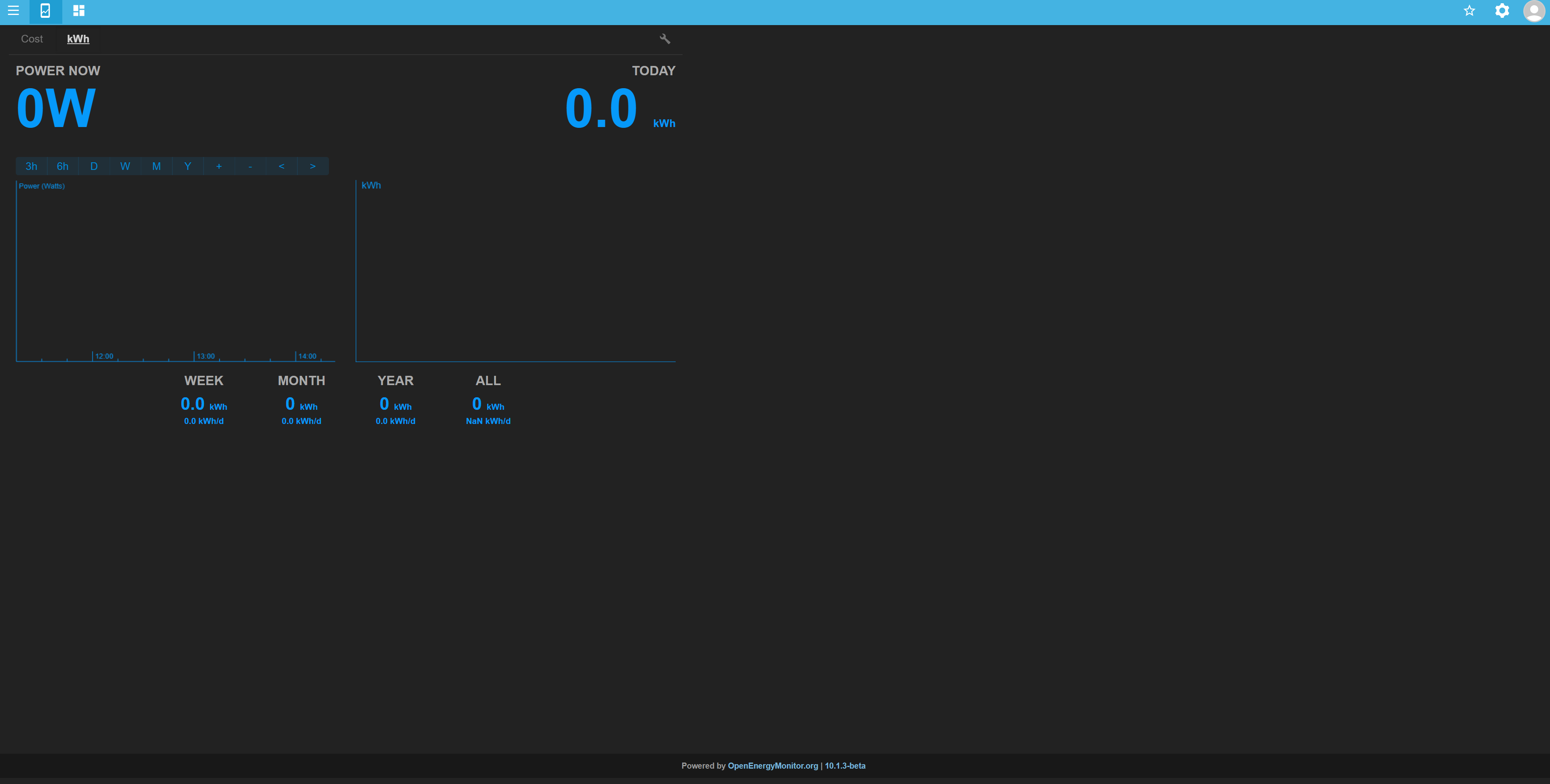
This is a post v10 myelectric page also $fullwidth=false and the exact same settings window size etc etc
Considering they are both using $fullwidth=false my only criticism of the pre-v10 would be that it could have perhaps extended the graphs vertically to fill the screen, it knows where the screen ends as the footer (as seen in the post-v10 but not displayed on my live server) is correctly positioned.
Whereas the post-v10 layout is not only smaller overall, it has much narrower report periods, both time wise and screen wise. Despite the layout being side-by-side rather than stacked like the pre-v10, the vertical scale isn’t much greater than the pre-v10, it’s just half as wide, which equates to half the detail. Plus it is not centred.
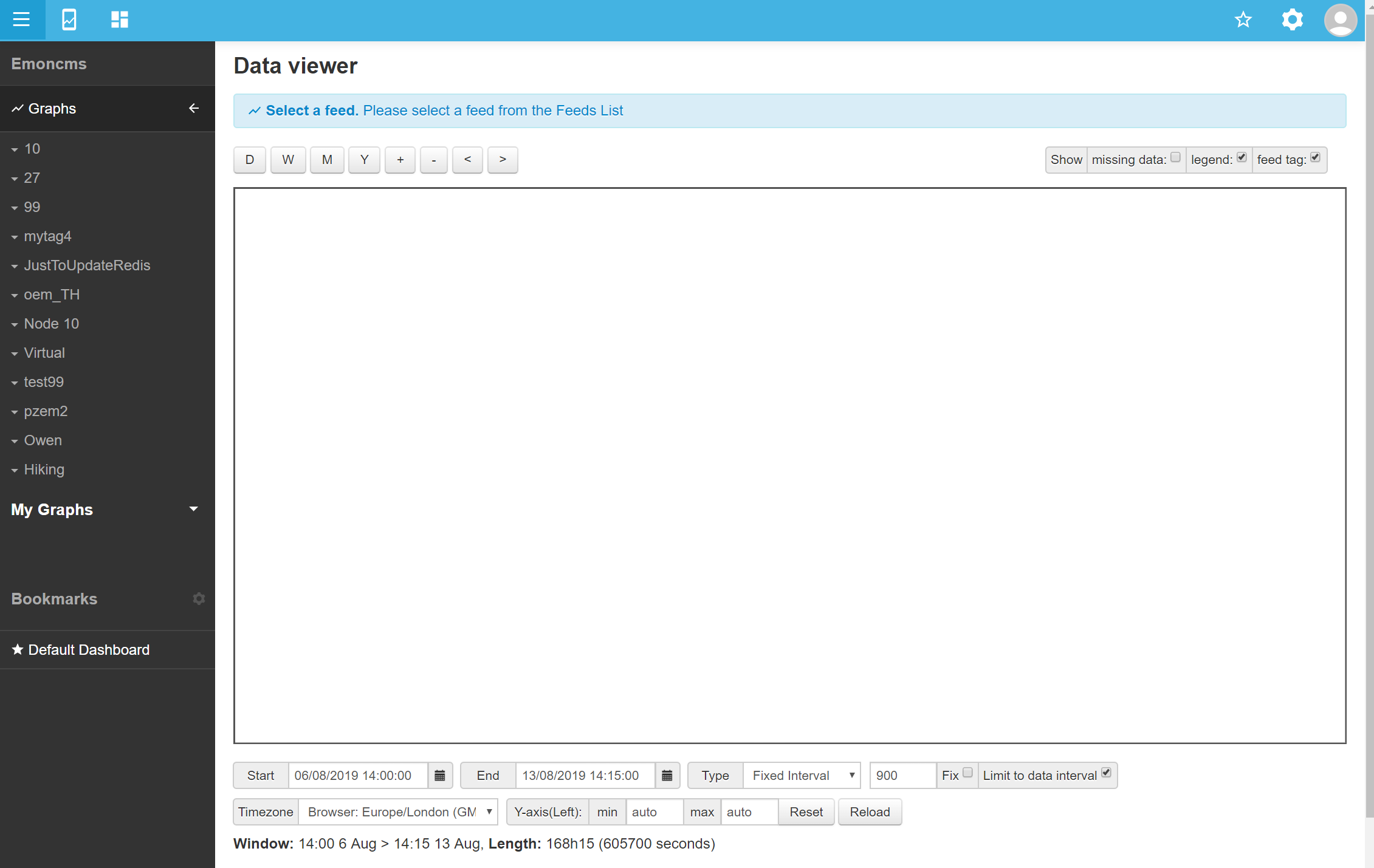
Possibly, but are you saying that’s by design? Does accommodating smaller screens need to come at the cost of supporting larger ones?
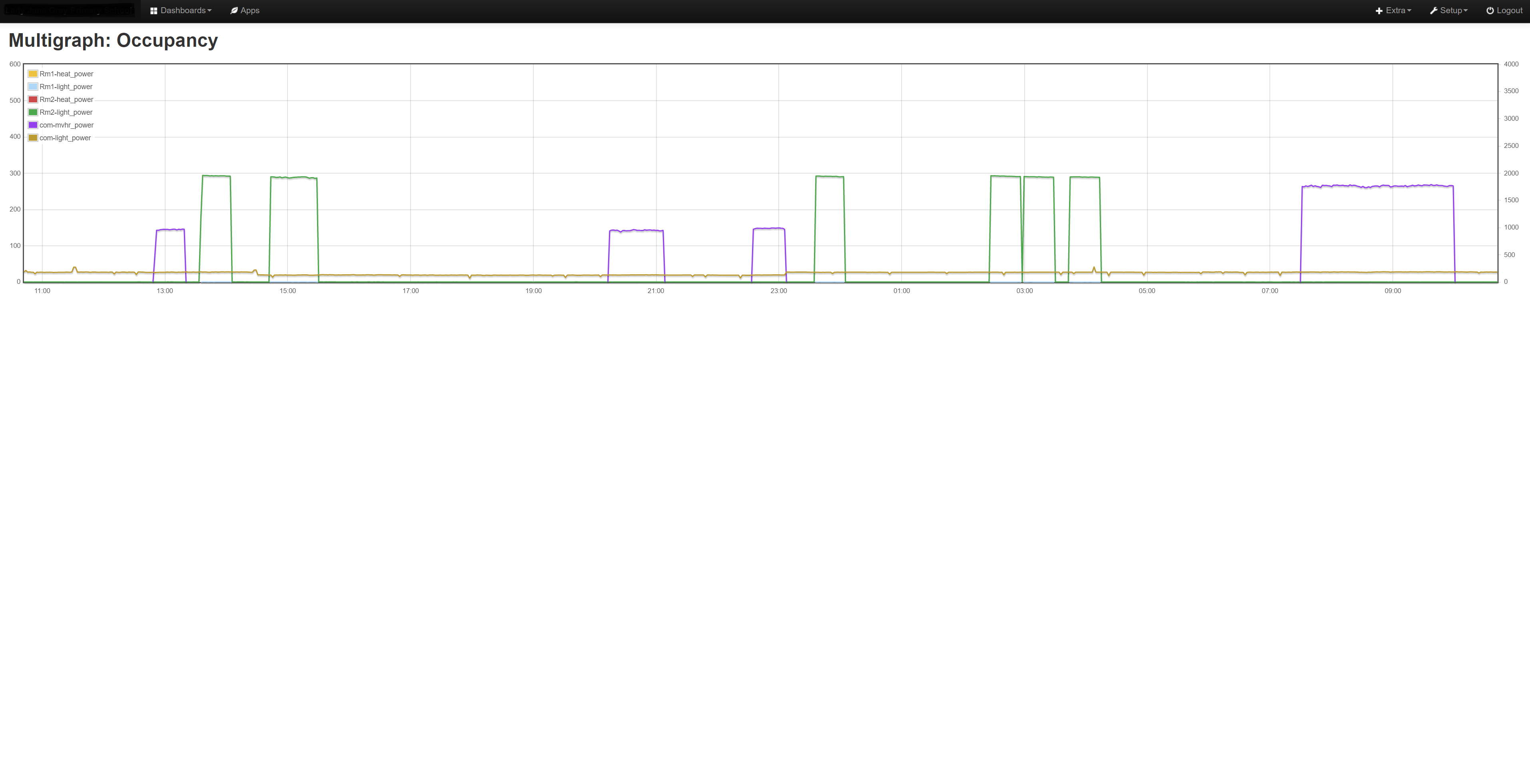
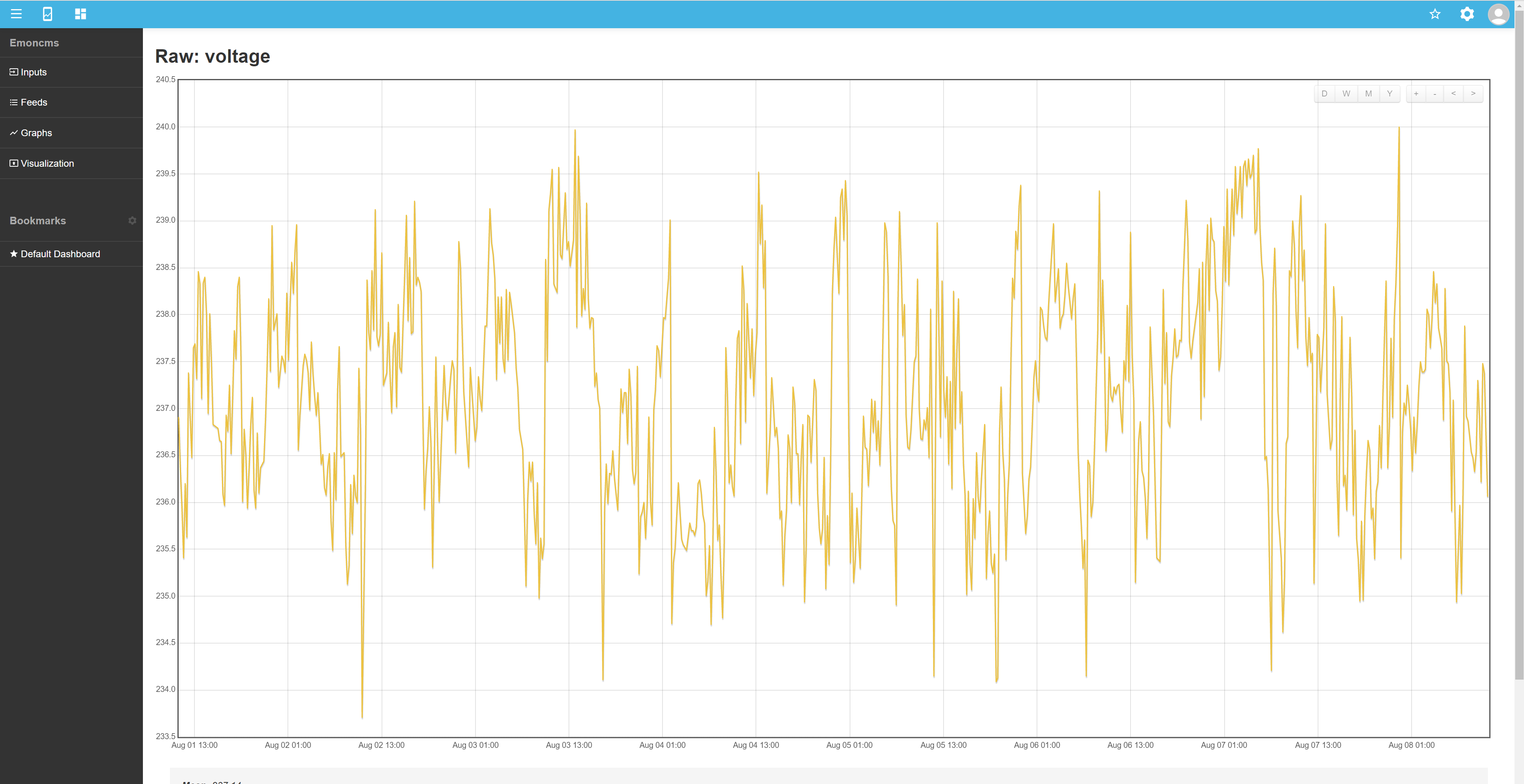
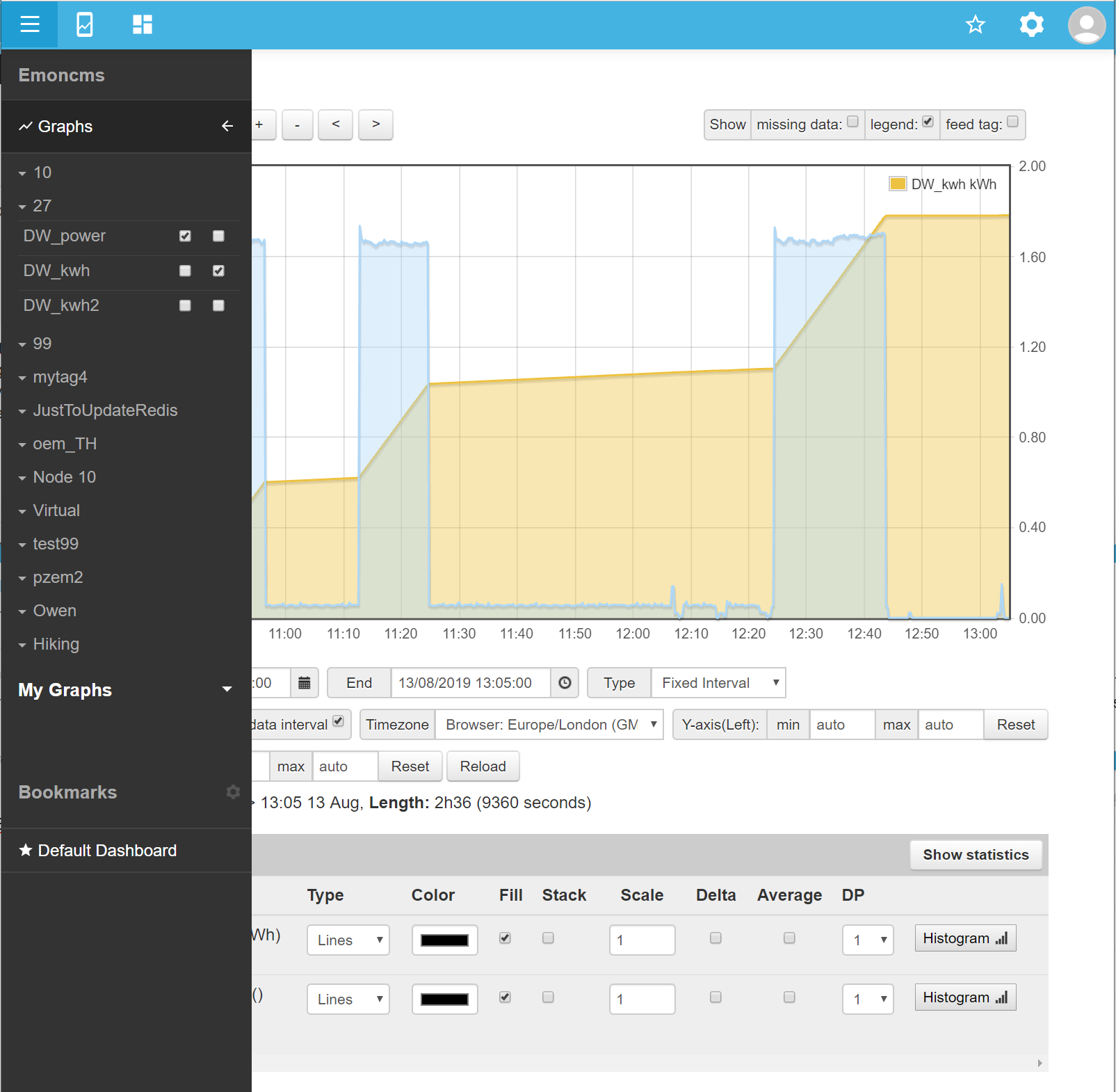
It would be nice to be able to see data in greater detail for a longer reporting period , especially when interrogating graphs. Here is a pre-v10 multigraph (same settings as above)
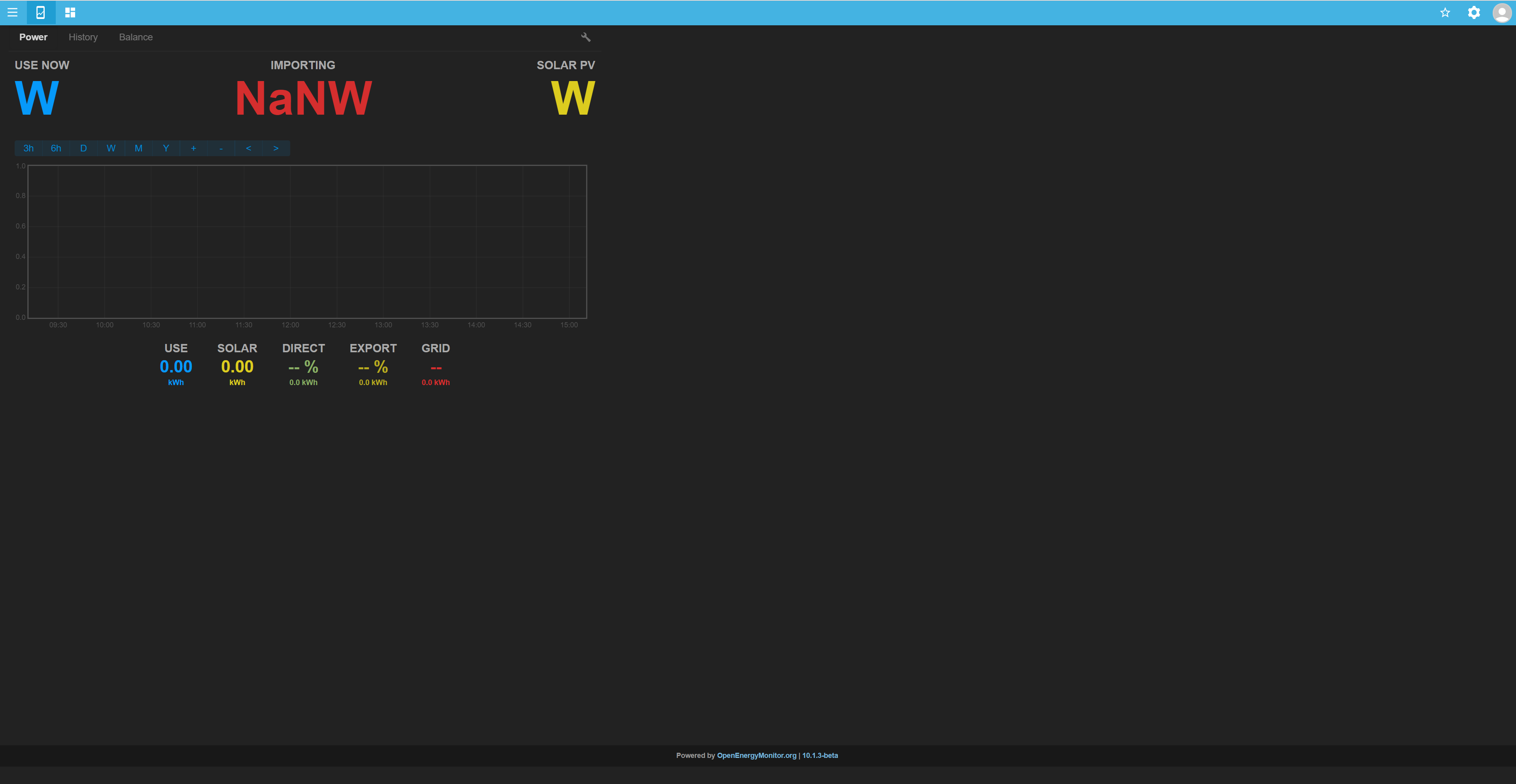
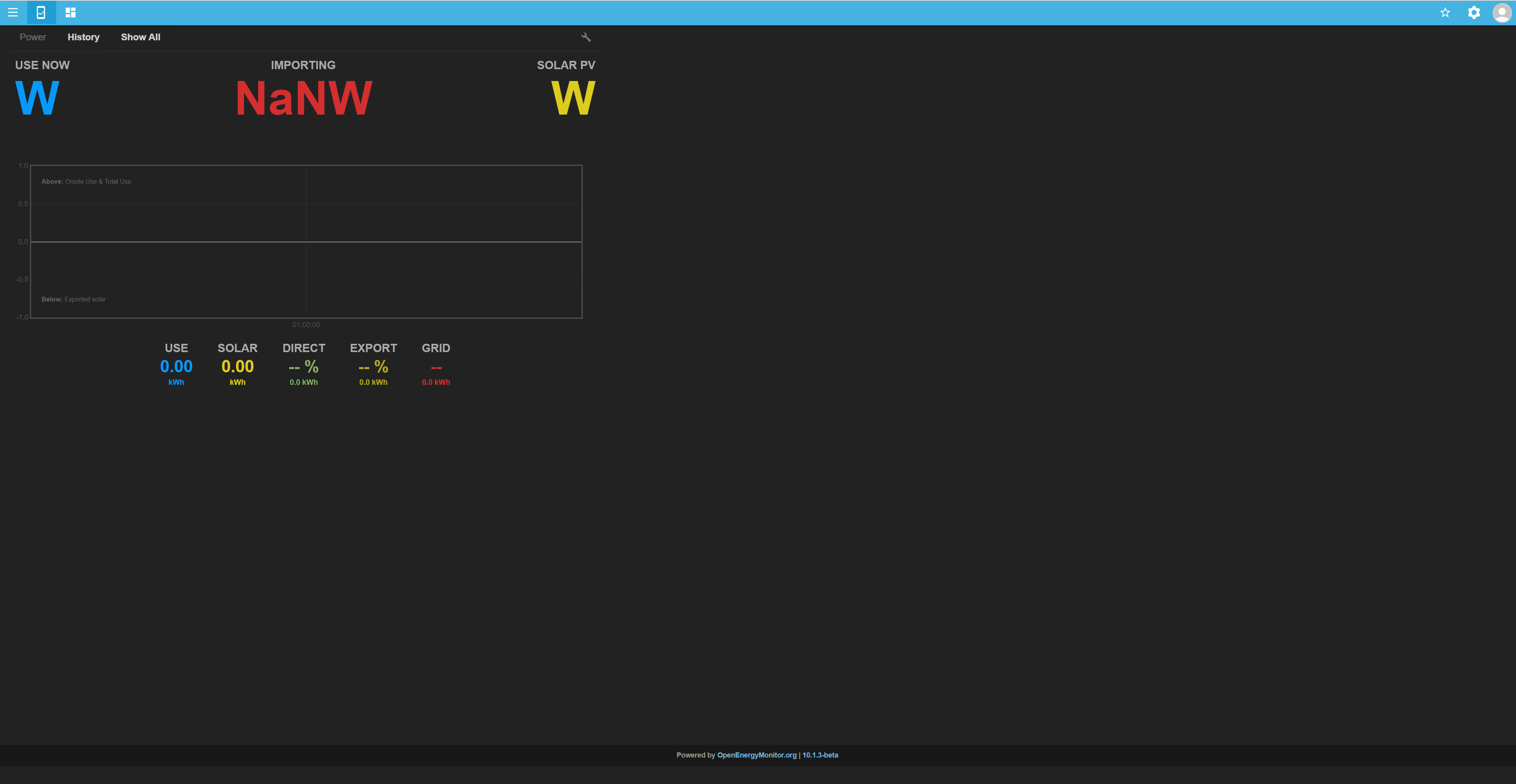
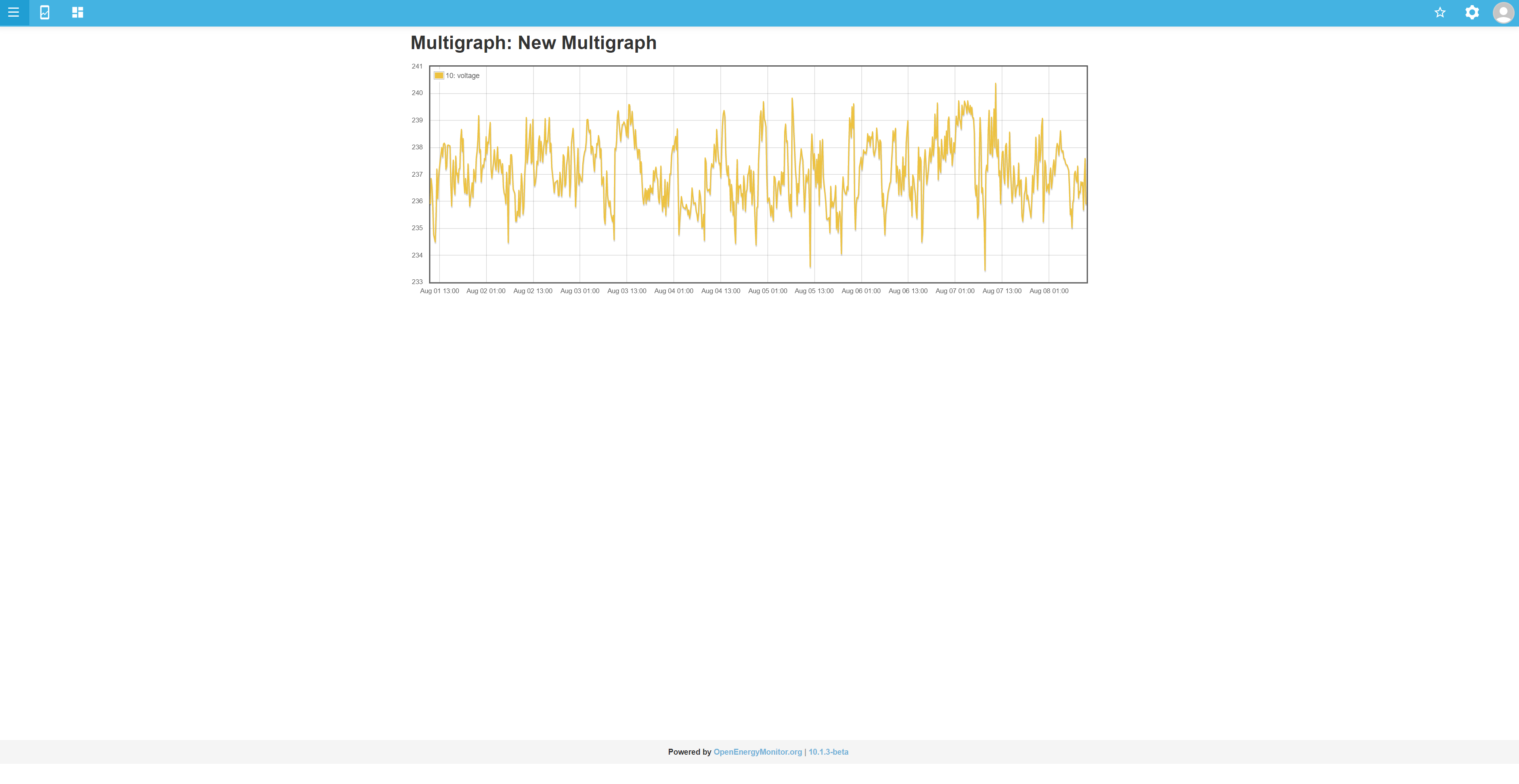
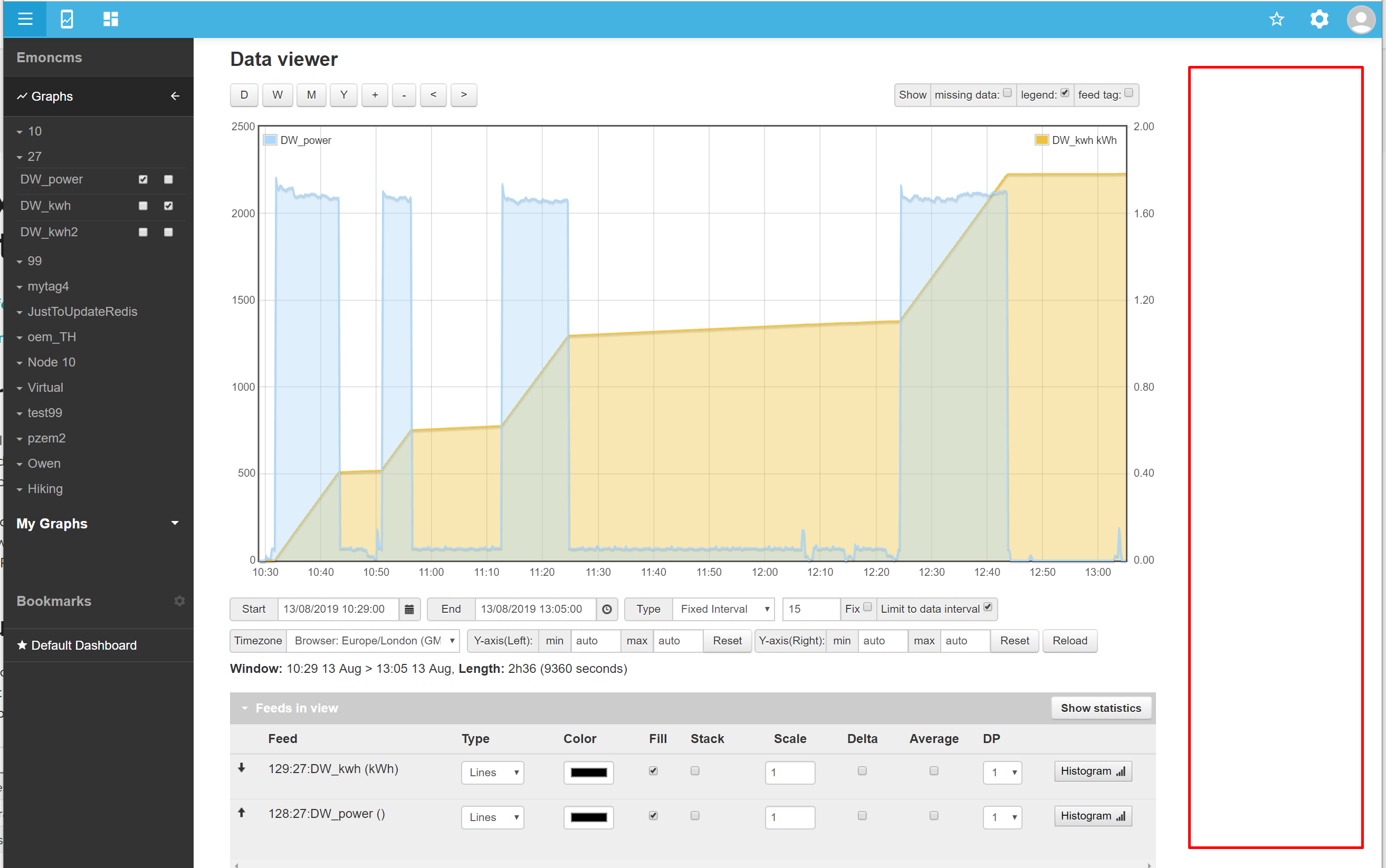
Same issue with the limited height, but at least it’s full width, here’s a post-v10 multigraph (same settings)
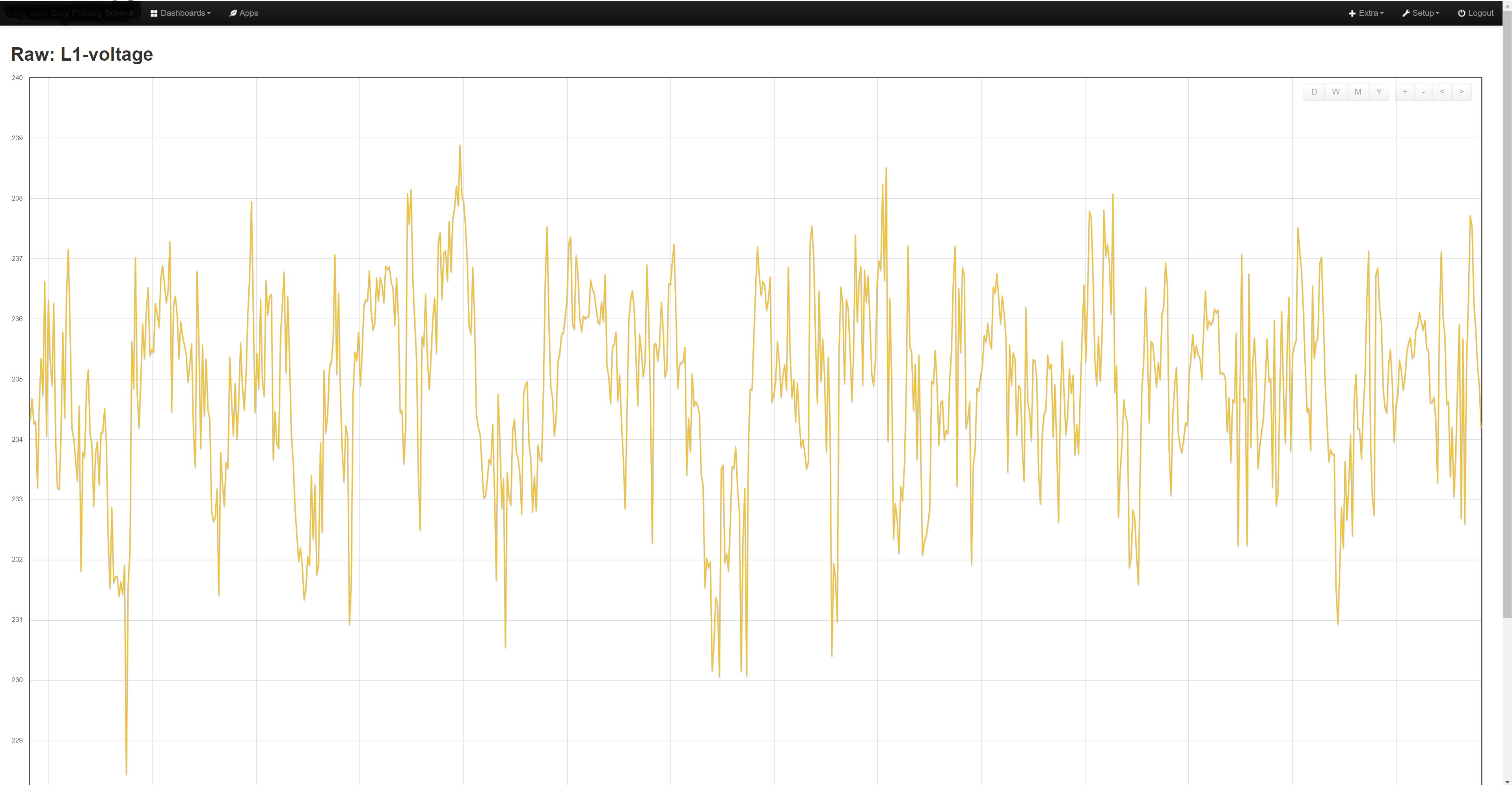
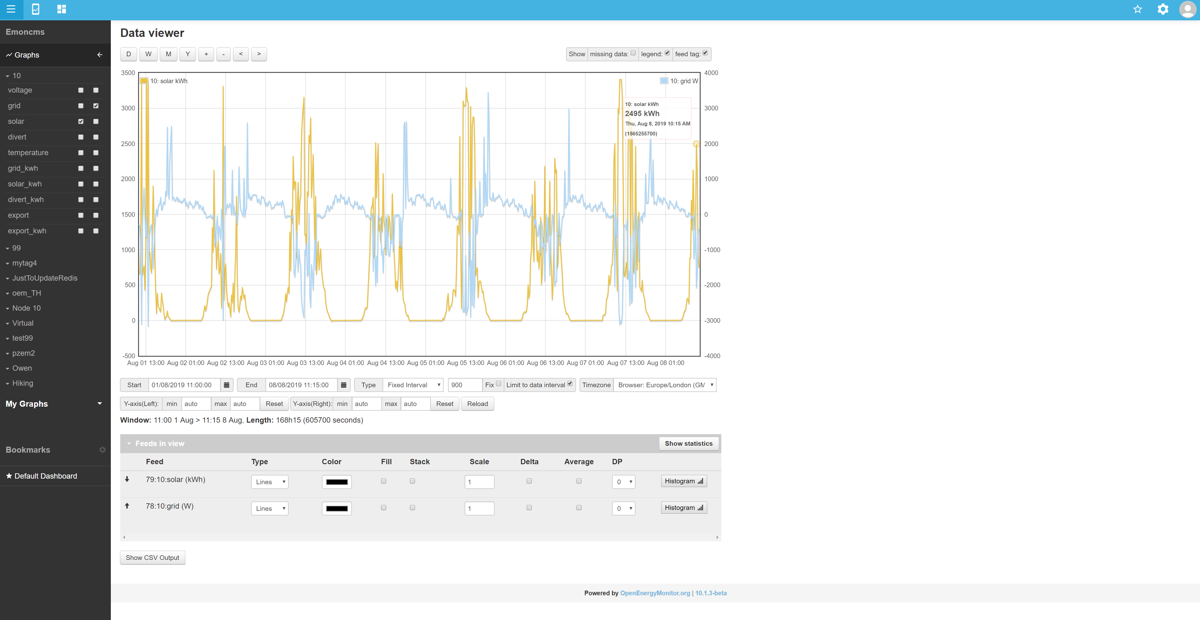
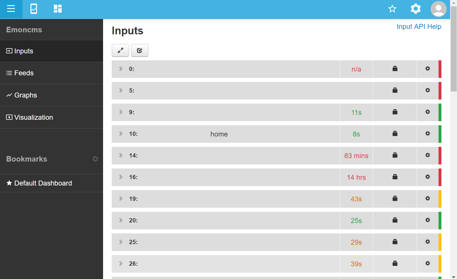
This is a pre-v10 rawdata visualisation after clicking the emoncms “fullscreen” button in Viz
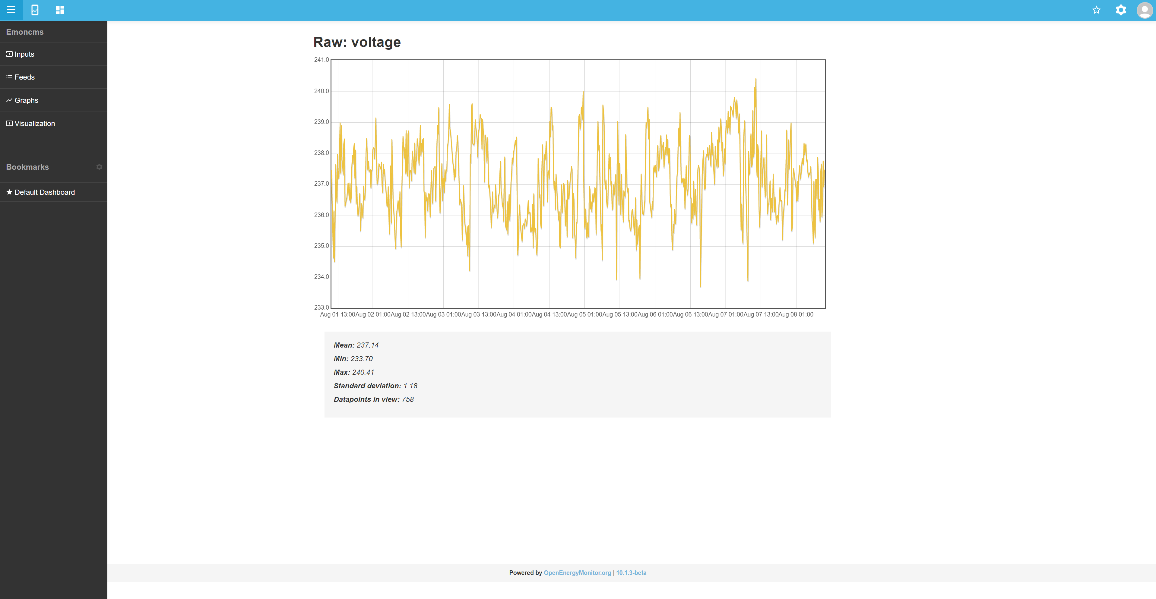
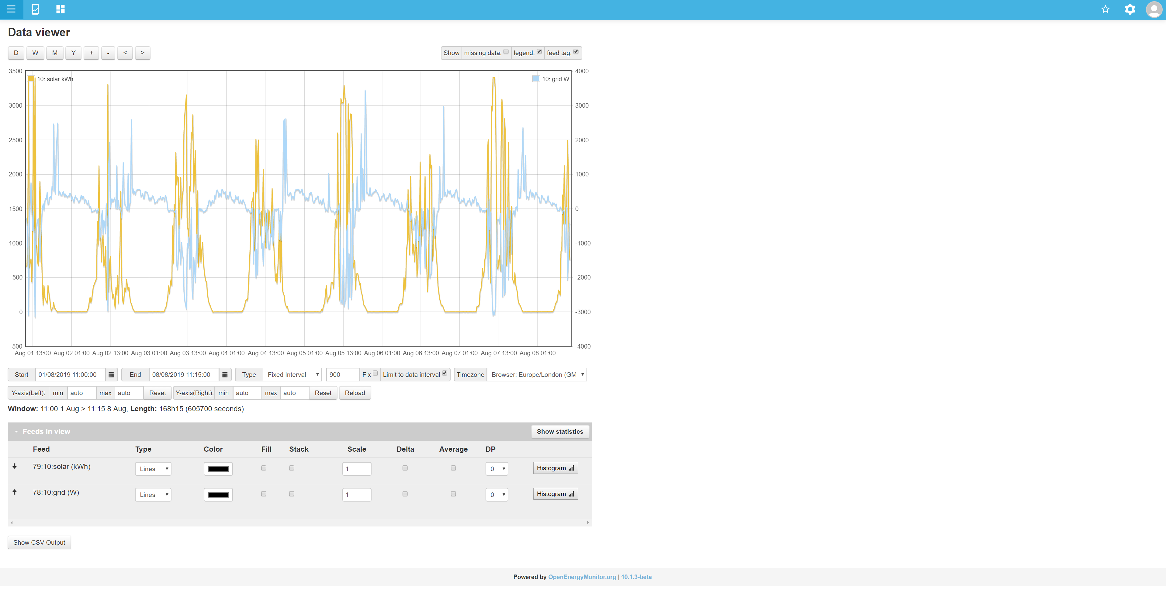
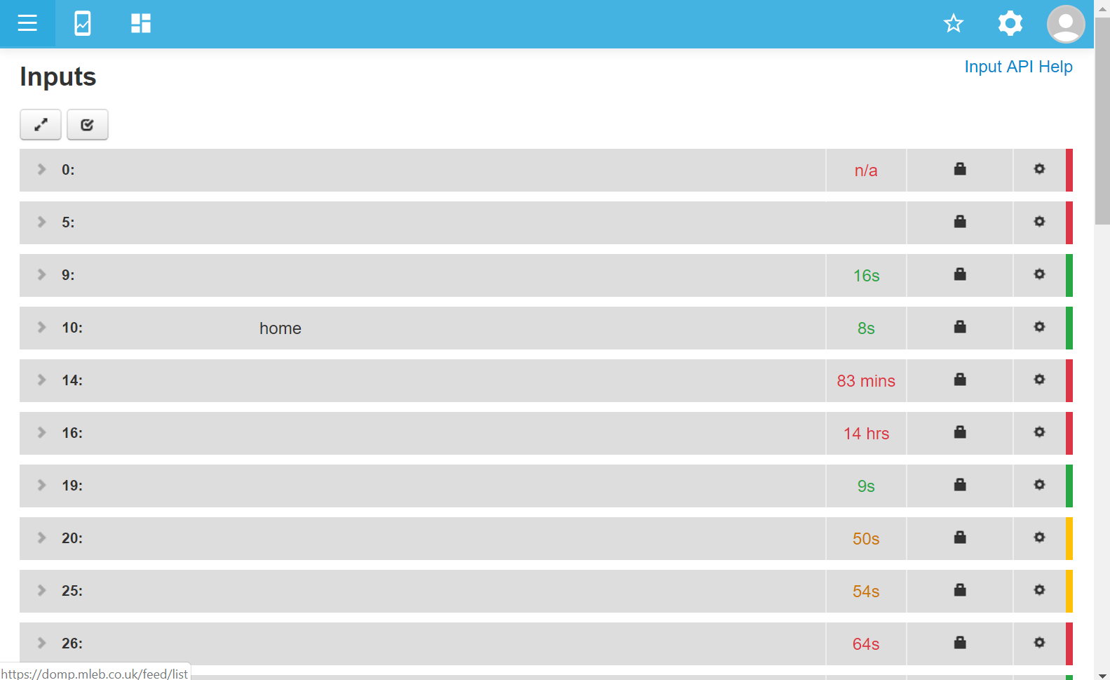
Possibly a bit too much height there as you need to scroll to see it all, but that is a far better view for looking at raw data in detail than the post-v10 page generated by the same “fullscreen” button in viz
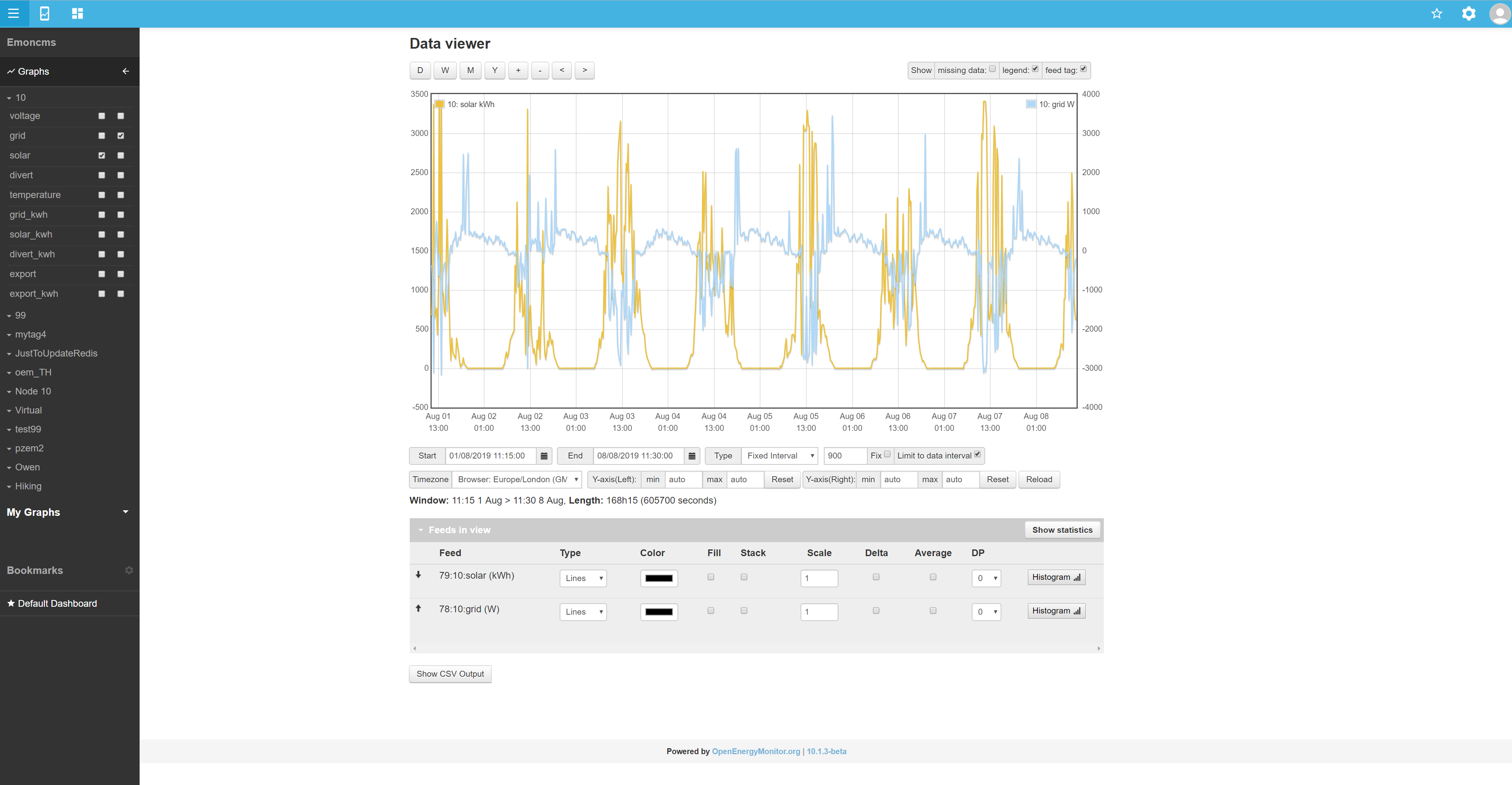
I think part of the issue is that honouring $fullwidth isn’t (wasn’t?) consistent, all of the above is with both servers set to $fullwidth=false; mainly because I do not like the way that $fullwidth=true; changes the dashboards and apps to be left aligned rather than centre aligned (much like the current app even without $fullwidth=true). So you see the pre-v10 wasn’t always NOT fullwidth when $fullwidth=false is set. Below is the same rawdata (as immediately above) but with $fullwidth=true set
Much better! But unfortunately it doesn’t get applied to either the apps or the graphs
and the pages are left aligned to the menu
unless you set $fullwidth=false
but that only centres the graph module not the apps module
or the dashboards $fullwidth=false:
$fullwidth=true so dash becomes left aligned to the menu
Notice how the footer is always centred regardless of the menu collapse or $fullwidth setting, this should IMO apply to all dashboards, graphs and apps too. The page should always be centred in the page, collapsing/uncollapsing the menu should just widen/narrow that screen.
So going back to the original observations with the myelectric page, to sum up I think all app, dash, graph and viz pages should
- centre align on page (even if $fullwidth=true)
- scale horizontally to use full width when $fullwidth=true
- scale vertically to utilise the available height down to the footer (regardless of $fullwidth)
obviously there would be min page sizes that introduce scroll bars on smaller screens/windows
more specific to the my electric page, why are the graphs now side-by-side? If it’s to accommodate smaller devices could it be dynamically switched from the old layout on smaller devices? Or be a user setting? I think the older stacked layout would scale better for most screens.
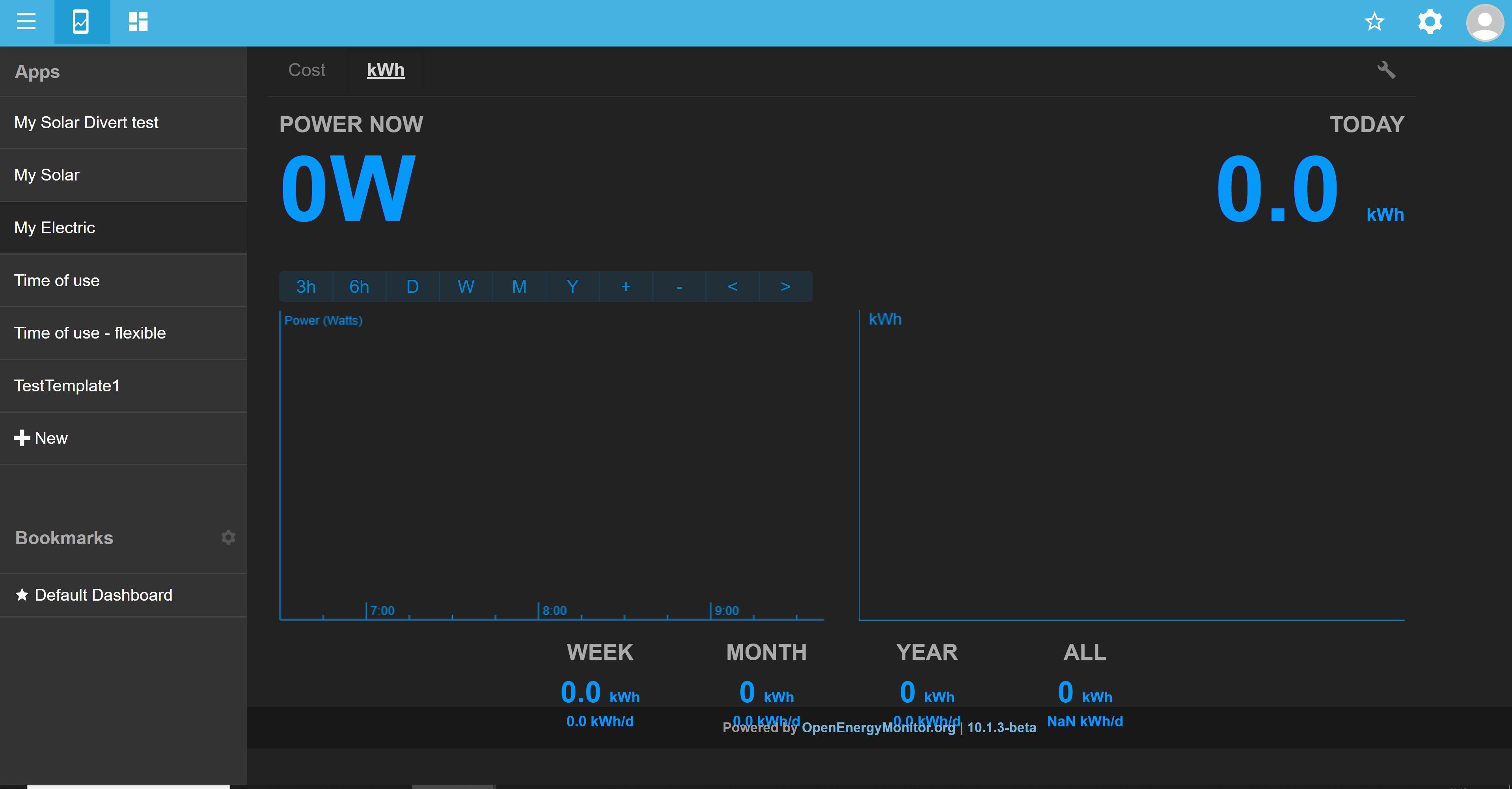
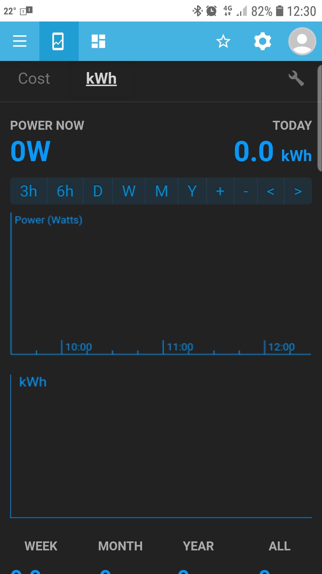
Oh! I just took a look at the myelectric on my mobile and was pretty surprised to see the graphs stacked! That is indeed IMO the better way, but now I’m confused as to why the layout was changed for non-mobile users, why not just keep the stacked view for all?