As you can see, the price per kWh is £0.16999 per kWh so 466 W (0.466 kWh) should be 7.8p not £78.20. In the bottom left of the first image, it shows the entire energy shown on the graph is 7.8 kWh and costs £1.22, both of which are correct. Only the tooltip is incorrect.
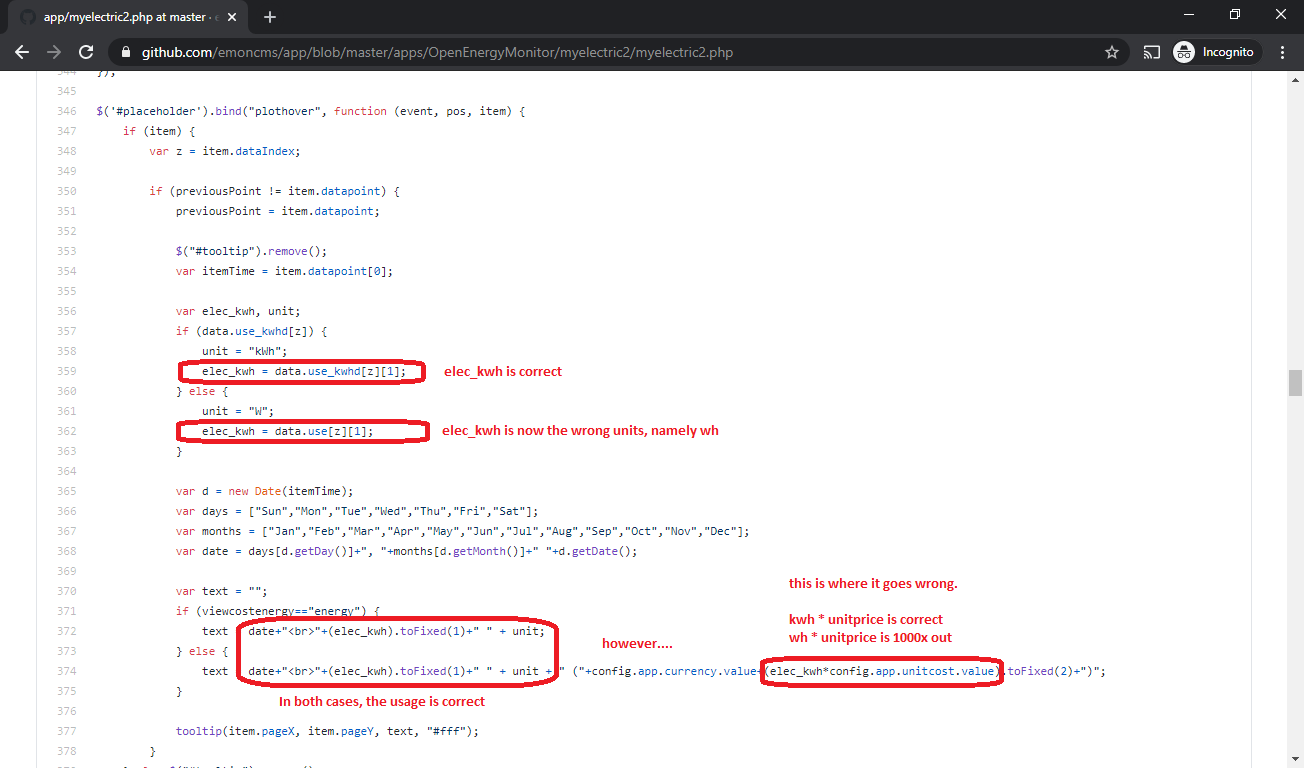
You can see in the code where the mistake is. For the tooltip it will either show W or kW depending on usage, but both values are multiplied by the same kWh rate. As you’d expect, this is causing W price to be 1000x out
I think perhaps it’s better to hide the cost all together in the power view? Because the units are in Watts and the interval between data periods change as you zoom in and out the cost for a particular interval would need to take this into account. The cost of the view is shown below the graph, perhaps that is enough?