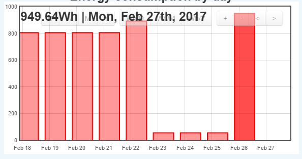
I noticed that the bars are a little bit misaligned with the proper date:
As you can see, the column for February 27th (highlighted) is aligned more with Feb 26 on the x-axis.
I’d be very grateful if someone could explain whether this is normal or if it can be fixed in some way.
I am running a self-hosted emoncms low-write version 9.7.9, with a pre-built emonSD image from 3 May 2016
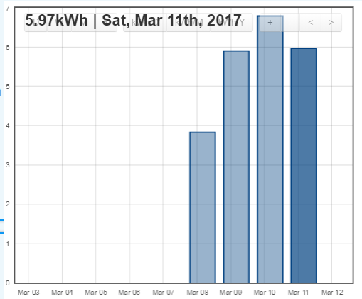
This issue has transformed in the past couple of days. The date that appears when I highlight a bar in the graph now corresponds to the date on the x-axis:
However, the power shown for each date actually belongs to the next date – i.e., 5.97kWh was consumed on 12 March, not 11 March. Could the change to daylight saving time have an effect on how the data is displayed?
I have also noticed some strange behaviour with the bar charts.
As far as I can see, the data it’s showing doesn’t match the data for 1 day from 0:00 to 0:00 on the next day.
As I’m plotting solar where boundaries are very clear from one day to the next in the raw data.
I have a day where production was less than 1kwh, followed by a day where production was over 7kwh.
The bar chart shows both days close to 4kwh.
Also as shown on your photo, the data for a bar sometimes cover the scaling buttons. It’s not always clear to me to make the information data go away so that I can select Day or week.
I’m afraid, I am not very clued up with php so I don’t know how to trace the root cause of the incorrect data being displayed, but I’m happy to try things under guidance if some knowledgeable person can provide some pointers.
Thanks.