You will recall there has been many forum posts and git issues raised over the years about text overflow on the menu bar due to long dashboard names or the sheer number of published dashboards, causing the ui formatting to fail, and the menu roll onto 2 lines.
A fix has just been merged into the master git branch which nicely handles this situation - Many thanks to Aymeric.
The fix measures the total amount of space used by the dashboard names & icons, and if it exceeds a set limit, the dashboard items will collapse down to icons (with no title other than a mouseover) to stop the menu rolling onto 2 lines.
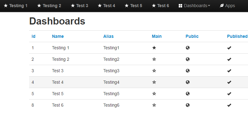
Example;
I have 6 dashboards displayed, and as you can see, their full names are displayed alongside their shortcut icon.
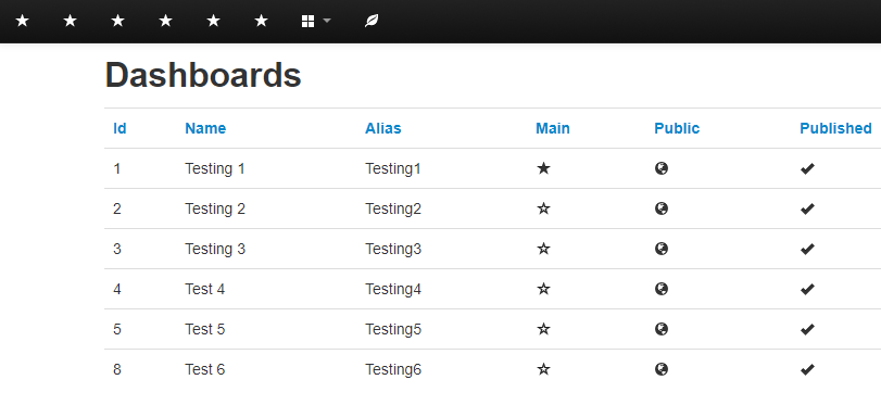
…but if I change the name of of ‘Test 3’ to ‘Testing 3’, the limit is exceeded, and the menu items collapse down to icons… (Mouseover still shows their names)
Paul