My emonCMS runs on the emonPI, not the hosted version.
I have some pickups on my central heating zone valves, and pump (optical isolators that feed a PIZero which makes API calls to the emonPI). As the data changes infrequently the PI only makes an API call to the emon on state change or every 10 minutes.
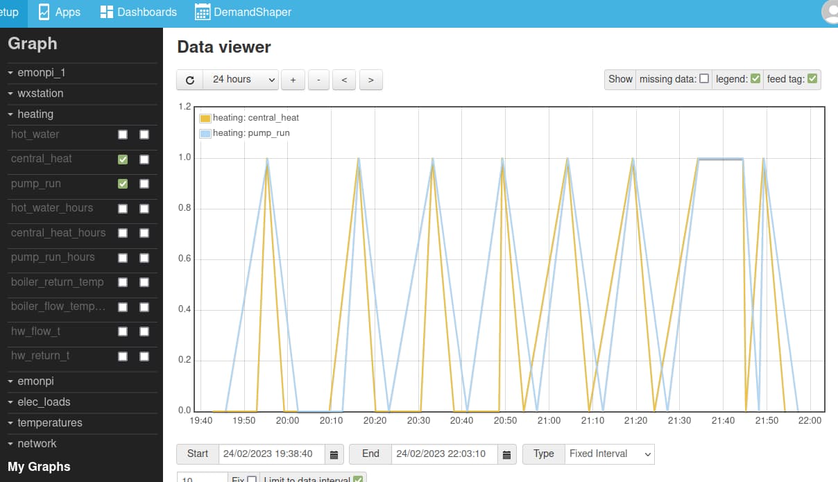
As the data changes so infrequently I process the input as PHPTIMESERIES, this works fine, except when I want to graph the data, the emon connects the infrequent points by lines and I get a “sawtooth” plot (pic 1). it’s hard to see what’s going on.
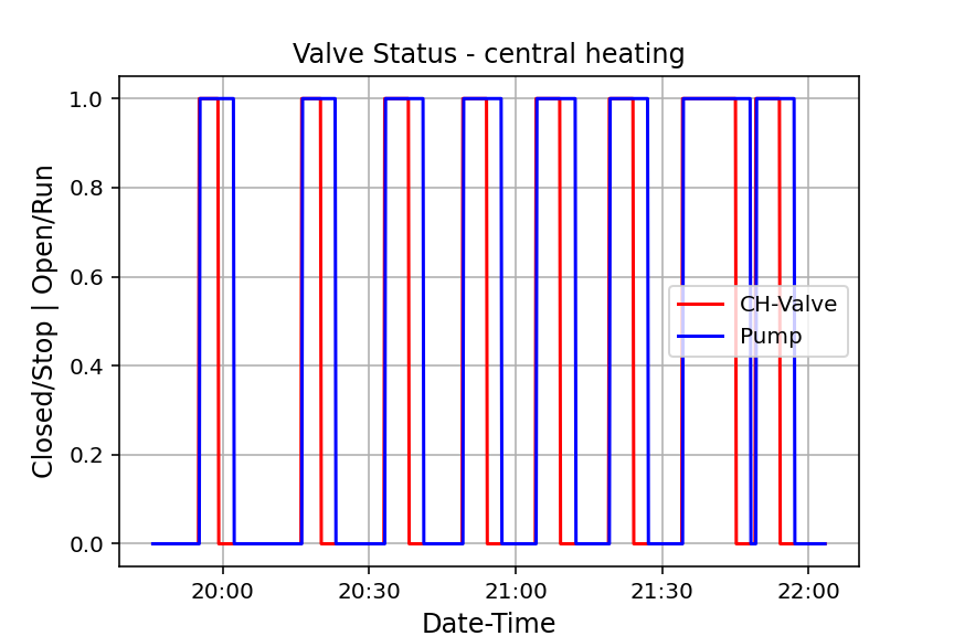
What I want to see is the value graphed held the same until the next change, so I get a “step”. I can do this myself with a bit of post processing in Python/Pandas, (pic2) it’s a lot easier to see the timing of the valve opening then the pump running.
Is there a way to do this in emonCMS?
PS if not possible and anyone wants it a little example of how to do this is attached, it uses dumped data but can also be used with the API reading scripts I shared earlier.
I tried this and got attached, it now draws a line vertically from 0 to the point? I don’t think it’s what I am looking for. Below explains what I am looking for zoomed in on a small time frame for one signal the heating valve, There are three points written to the emon
2023-02-24 19:52:50, 0 (valve has been closed for > 10 mins)
2023-02-24 19:55:10, 1 (valve opens)
2023-02-24 19:59:10, 0 (valve closes)
Between 19:55:10 and 19:59:10 the valve is open, if I were to look at the value of the feed “live” between these times it would be 1, i.e. the last value.
When I later plot the data , I would like the value between these times to be 1, not an interpolated line. I’ve drawn on the screenshot in red what I am looking for.
I could probably do this by changing the interface to write every 10 seconds and use PHPFINA for the feed, but this seems wasteful both in terms of storage and also the number of calls the interface has to write.
Industrially on control systems process historians etc it is quite common when acquiring the data to get sparse non frequent data sent/stored to reduce bandwith, power and storage. saving a value only on state change as the valve example here, or in the case of analogue signals if they change by more than a certain deadband or it’s more than a certain time since the last one.
There is then a setting in the signal meta data such that when it is queries/visualized the returned value between the set points can either be an interpolation, or the last value. In the case of last value it’s sometimes called a “step trend”
I see what you’re trying to get, but there’s no specific ‘step’ mode for the graphs.
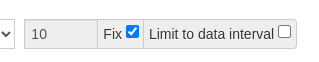
One way that might work is to set the interval to 10 seconds, check “Fix” and untick “Limit to data interval” and press reload. This fetches the data at 10 s interval and fills in the missing points.
This technique works well up to a certain zoom, and then it complains about too many points.
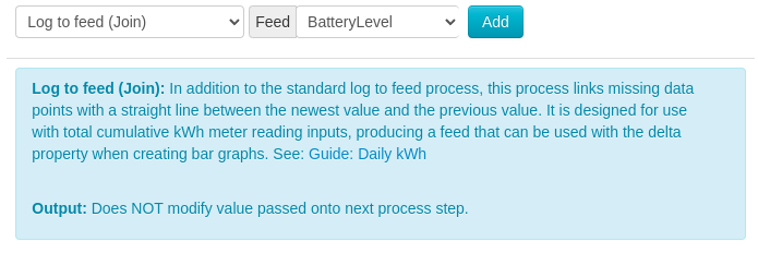
The other thing to try is a setup a PHPFINA feed with 10s interval, and use the “Log to feed (Join)” process step. This will allow you to upload new data periodically, and the feed will automatically fill in the missing points. Still a wasteful on space, but doesn’t take much more processing.
The tricky thing here is that it adds “missing data points with a straight line between the newest value and the previous value”, which isn’t quite what you want. If you can upload both old and new values each time the value changes, than it will hopefully create data in a stepped shape:
2023-02-24 19:52:50, 0
…time passes…
2023-02-24 19:55:10, 0 ← old value
2023-02-24 19:55:10, 1 ← new value
…time passes…
2023-02-24 19:59:10, 1 ← old value
2023-02-24 19:59:10, 0 ← new value
Neither are ideal solutions, but maybe one will work for you.
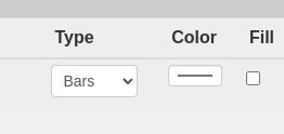
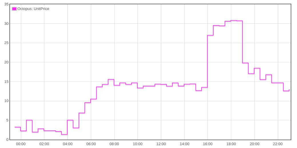
I found that I also needed to graph some data this way, so I had a go at adding this to the Graph module. It turned out to be really easy, so I submitted a pull request:
Should work on all feed types. Looks great with data from Agile Octopus…
Well done this is exactly what I was looking for! How do you define a feed as “Step”? Excuse my ignorance, I have never really understood git, but what’s the process now - does it end up in the “main build” of emon and I can add to the emonPI with an update?
When the maintainers of EmonCMS approve this request, it will be merged into the main build, and then you’ll be able to update your emonPi. I don’t know how long we’ll need to wait for that; they’re often busy with other things.
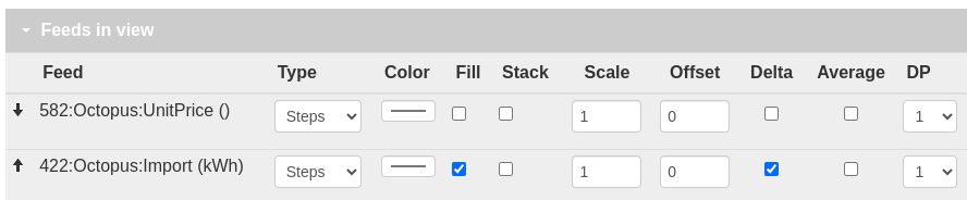
The new step type will appear in the Graph module; you won’t need to change any feeds.