@Gwil - This isn’t a criticism as you are doing a fine job, but are you aware the “OpenEnergyMonitor” is no longer an active link when in mobile view (on my phone at least). It is not really an issue as the “Community” below it still is a link, I have just grown used to stabbing at the larger area and now it doesn’t do anything. Is that a fault or by design?
My fault: poor design  It has been fixed.
1 Like
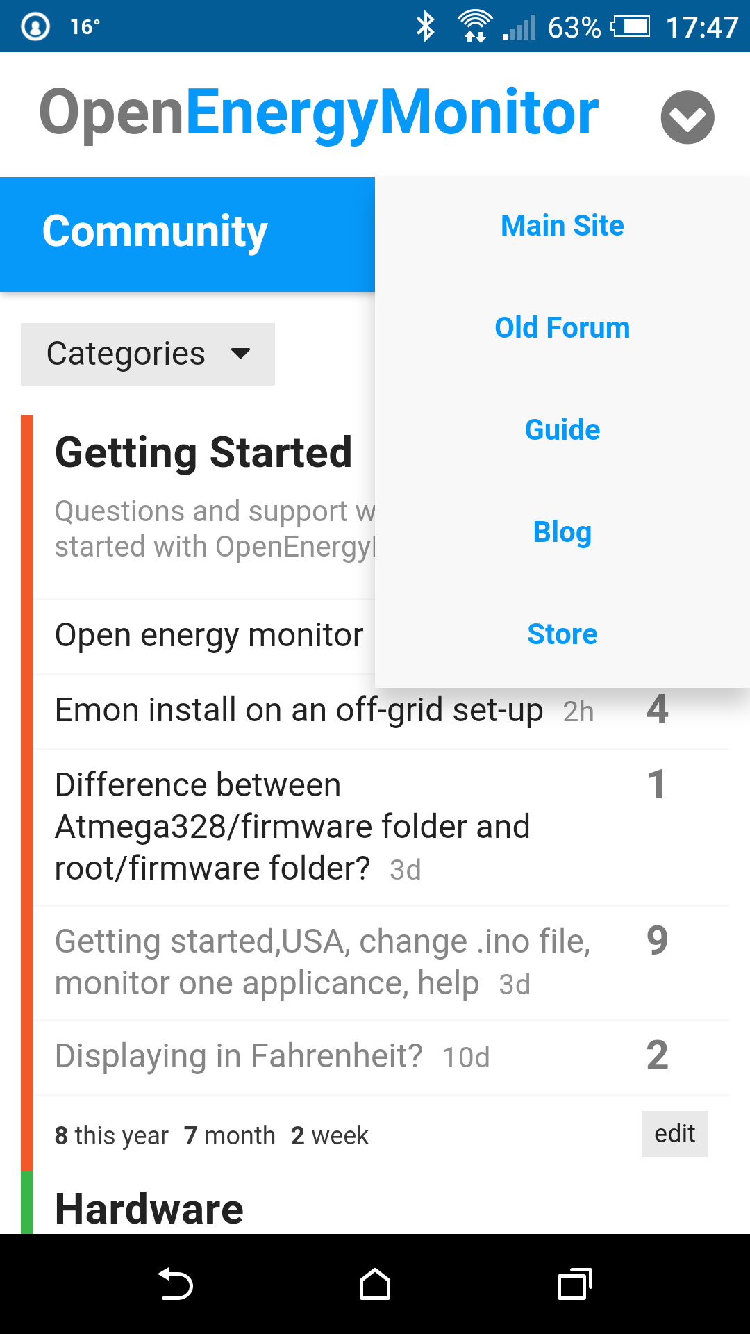
@Gwil Blue text on white looks much better and is consistent with the other menus.
There is an awful lot of ‘white’ in the menu background, perhaps if the width of the menu was reduced, it may look more balanced, what do you think?
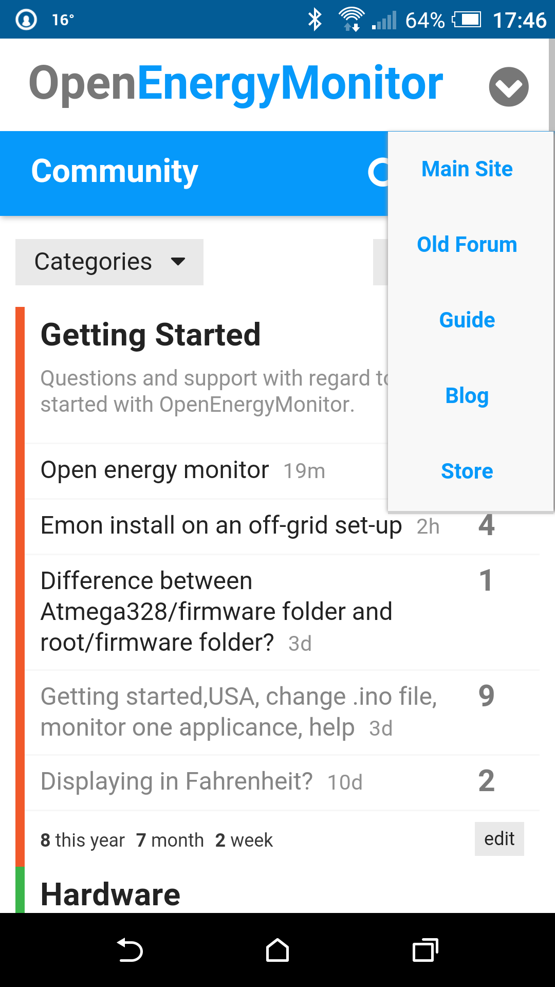
Having looked at that screen-grab again, I’ve just noticed that you aren’t seeing any of the icons I can see! They are FontAwesome icons. I could use an svg image for the chevron instead, but something isnt right here.
Yes that looks much better Paul. I do like left aligned text though!
@Gwil - I think this issue is on my side and not yours. I say that because I have a firewall with a content blocker. And I’m guessing it doesn’t like “custom web font” of FontAwesome (and I am guessing about the FontAwesome). If I flip to cellular data (LTE) and go around the firewall, the chevron appears. I’ll keep digging.
I wonder if it is because some icons are classed as branding (like Twitter, etc).
The colour, width & alignment of the mobile site menu looks pretty good now.
We’ll done @Gwil
Paul
1 Like