I’m currently stuffing this data into an influxDB and can use Grafana. What I’m missing is a good way of analyzing the data. Like I want daily/weekly energy usage, for example.
I was eyeing at the emoncms docker container. Does the emoncms provide a mechanism to subscribe to different topics and generate the energy usage charts I see screen shots of?
I use the wireless relays that are available in the shop on this site to control the immersion heaters (fed by a PV diverter) of my thermal store and buffer store.
I have two emonTH units posting the thermal store temperatures over MQTT to the local emoncms, which then gets re-broadcast out to a Pi subscriber which runs some Python and controls via MQTT and the emoncms broker the wireless relays to determine which, if any, store gets heated.
Currently trying to add MQTT and some control over the solar thermal installation which also heats the stores …
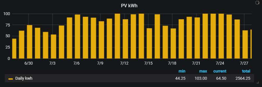
If you want weekly energy values, you choose last seven days from the time picker, show, as table from options,
and total from the available value choices. I’ve selected min, max and current as well.
The total (for the week, in this example) is shown in the legend at the botom right of the graph. e.g.